Appearance
Top app bars
Top app bars display information and actions related to the current screen.
Contents
- Design and API Documentation
- Using top app bars
- Regular top app bars
- Collapsing top app bar
- Contextual action bar
- Theming
Design and API Documentation
Using top app bars
Before you can use Material top app bars, you need to add a dependency to the Material Components for Android library. For more information, go to the Getting started page.
Making top app bars accessible
Android's top app bar component APIs provide support for the navigation icon, action items, overflow menu and more, to inform the user what each action performs. While optional, their use is strongly encouraged.
Content descriptions
When using icons for navigation, action items and other elements of top app bars, you should set a content description for them so that screen readers like TalkBack are able to announce their purpose or action.
For an overall content description of the top app bar, set an android:contentDescription or use the setContentDescription method on the MaterialToolbar.
For the navigation icon, this can be achieved via the app:navigationContentDescription attribute or setNavigationContentDescription method.
For action items and items within the overflow menu, the content description needs to be set in the menu:
xml
<menu ...>
    ...
    <item
          ...
          android:contentDescription="@string/content_description_one" />
    <item
          ...
          android:contentDescription="@string/content_description_two" />
</menu>
For images within collapsing top app bars, set an android:contentDescription or use the setContentDescription method for the ImageView.
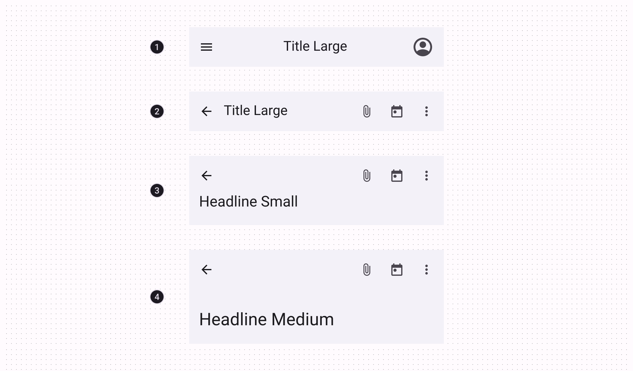
Types
There are four types of top app bars: 1. Center aligned, 2. Small, 3. Medium, 4. Large.
For implementation purposes, the Center aligned & Small types can be grouped into Regular top app bars, while the Medium & Large types can be grouped into Collapsing top app bars.
API and source code:
CoordinatorLayoutAppBarLayoutMaterialToolbarCollapsingToolbarLayout
Regular top app bars
The top app bar provides content and actions related to the current screen. It’s used for branding, screen titles, navigation, and actions.
Small top app bar example
The following example shows a Small top app bar with a page title, a navigation icon, two actions, and an overflow menu.
In the layout:
xml
<androidx.coordinatorlayout.widget.CoordinatorLayout
    ...
    android:layout_width="match_parent"
    android:layout_height="match_parent">

    <com.google.android.material.appbar.AppBarLayout
        android:layout_width="match_parent"
        android:layout_height="wrap_content">

        <com.google.android.material.appbar.MaterialToolbar
            android:id="@+id/topAppBar"
            android:layout_width="match_parent"
            android:layout_height="wrap_content"
            android:minHeight="?attr/actionBarSize"
            app:title="@string/page_title"
            app:menu="@menu/top_app_bar"
            app:navigationIcon="@drawable/ic_close_24dp" />

    </com.google.android.material.appbar.AppBarLayout>

    <!-- Note: A RecyclerView can also be used -->
    <androidx.core.widget.NestedScrollView
        android:layout_width="match_parent"
        android:layout_height="match_parent"
        app:layout_behavior="@string/appbar_scrolling_view_behavior">

        <!-- Scrollable content -->

    </androidx.core.widget.NestedScrollView>

</androidx.coordinatorlayout.widget.CoordinatorLayout>
Note: In order to allow your Top App Bar to grow taller when the system font setting increases, you can use android:layout_height="wrap_content" + android:minHeight="?attr/actionBarSize" on your MaterialToolbar, as shown in the example above.
In @menu/top_app_bar.xml:
xml
<menu xmlns:android="http://schemas.android.com/apk/res/android"
    xmlns:app="http://schemas.android.com/apk/res-auto">

    <item
        android:id="@+id/edit"
        android:title="@string/edit"
        android:contentDescription="@string/content_description_search"
        app:showAsAction="ifRoom" />

    <item
        android:id="@+id/favorite"
        android:icon="@drawable/ic_favorite_24dp"
        android:title="@string/favorite"
        android:contentDescription="@string/content_description_favorite"
        app:showAsAction="ifRoom" />

    <item
        android:id="@+id/more"
        android:title="@string/more"
        android:contentDescription="@string/content_description_more"
        app:showAsAction="never" />

</menu>
In menu/navigation icon drawables:
xml
<vector
    ...
    android:tint="?attr/colorControlNormal">
    ...
</vector>
In code:
kt
topAppBar.setNavigationOnClickListener {
    // Handle navigation icon press
}

topAppBar.setOnMenuItemClickListener { menuItem ->
    when (menuItem.itemId) {
        R.id.edit -> {
            // Handle edit text press
            true
        }
        R.id.favorite -> {
            // Handle favorite icon press
            true
        }
        R.id.more -> {
            // Handle more item (inside overflow menu) press
            true
        }
        else -> false
    }
}
Note: The above example is the recommended approach and, in order for it to work, you need to use a Theme.Material3.* theme containing the NoActionBar segment, such as the Theme.Material3.Light.NoActionBar. If not, an action bar will be added to the current Activity window. The MaterialToolbar can be set as the support action bar and thus receive various Activity callbacks, as shown in this guide.
Applying scrolling behavior to the top app bar
The following example shows the top app bar positioned at the same elevation as content. Upon scroll, it increases elevation and lets content scroll behind it.
In the layout:
xml
<androidx.coordinatorlayout.widget.CoordinatorLayout
    ...>

    <com.google.android.material.appbar.AppBarLayout
        ...
        app:liftOnScroll="true">

        <com.google.android.material.appbar.MaterialToolbar
            ...
            />

    </com.google.android.material.appbar.AppBarLayout>

    ...

</androidx.coordinatorlayout.widget.CoordinatorLayout>
Note: If your scrolling view (RecyclerView, ListView, etc.) is nested within another view (e.g., a SwipeRefreshLayout), you should make sure to set app:liftOnScrollTargetViewId on your AppBarLayout to the id of the scrolling view. This will ensure that the AppBarLayout is using the right view to determine whether it should lift or not, and it will help avoid flicker issues.
The following example shows the top app bar disappearing upon scrolling up, and appearing upon scrolling down.
In the layout:
xml
<androidx.coordinatorlayout.widget.CoordinatorLayout
    ...>

    <com.google.android.material.appbar.AppBarLayout
        ...>

        <com.google.android.material.appbar.MaterialToolbar
            ...
            app:layout_scrollFlags="scroll|enterAlways|snap"
            />

    </com.google.android.material.appbar.AppBarLayout>

    ...

</androidx.coordinatorlayout.widget.CoordinatorLayout>
Optionally, you can change the style in which the app bar disappears and appears when scrolling by setting a scroll effect. By default, a scroll effect of none is set which translates the app bar in-step with the scrolling content. The following option shows setting the compress scroll effect which clips the top app bar until it meets the top of the screen:
In the layout:
xml
<androidx.coordinatorlayout.widget.CoordinatorLayout
    ...>

    <com.google.android.material.appbar.AppBarLayout
        ...>

        <com.google.android.material.appbar.MaterialToolbar
            ...
            app:layout_scrollFlags="scroll|enterAlways|snap"
            app:layout_scrollEffect="compress"
            />

    </com.google.android.material.appbar.AppBarLayout>

    ...

</androidx.coordinatorlayout.widget.CoordinatorLayout>
Status bar and edge-to-edge
A common configuration for modern Top App Bars, as seen above, is to have a seamless color shared with the status bar. The best way to achieve this is to follow the edge-to-edge guidance, which will result in a transparent status bar that lets the background color of the Top App Bar show through.
Make sure to set android:fitsSystemWindows="true" on your AppBarLayout (or MaterialToolbar if not using AppBarLayout), so that an extra inset is added to avoid overlap with the status bar.
If your AppBarLayout scrolls and content is visible under the status bar, you can set the AppBarLayout's statusBarForeground to a MaterialShapeDrawable to let AppBarLayout automatically match the status bar color to its own background.
In code:
kt
appBarLayout.statusBarForeground =
    MaterialShapeDrawable.createWithElevationOverlay(context)
Or if using Tonal Surface Colors instead of Elevation Overlays, you can simply set the statusBarForeground to colorSurface to let AppBarLayout automatically match the status bar color to its own background:
kt
appBarLayout.setStatusBarForegroundColor(
    MaterialColors.getColor(appBarLayout, R.attr.colorSurface))
Center aligned top app bar example
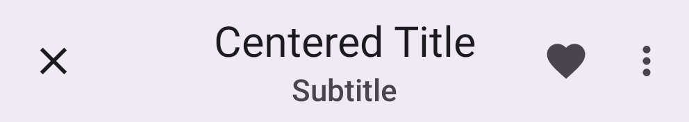
All of the same guidance and code from the sections above is relevant for Center aligned top app bars. The only additional configuration needed for centering is setting the app:titleCentered and/or app:subtitleCentered attributes to true on your MaterialToolbar.
Anatomy and Key properties
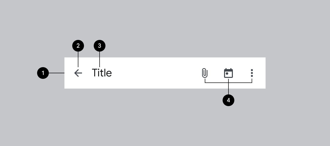
- Container
- Navigation icon (optional)
- Title (optional)
- Action menu items (optional)
Container attributes
| Element | Attribute | Related method(s) | Default value |
|---|---|---|---|
| Color | android:background | setBackgroundgetBackground | ?attr/colorSurface |
MaterialToolbar elevation | android:elevation | setElevationgetElevation | 4dp |
AppBarLayout elevation | android:stateListAnimator | setStateListAnimatorgetStateListAnimator | 0dp to 4dp (see all states) |
Navigation icon attributes
| Element | Attribute | Related method(s) | Default value |
|---|---|---|---|
MaterialToolbar icon | app:navigationIcon | setNavigationIcongetNavigationIcon | null |
MaterialToolbar icon color | app:navigationIconTint | setNavigationIconTint | ?attr/colorOnSurface |
Title attributes
| Element | Attribute | Related method(s) | Default value |
|---|---|---|---|
MaterialToolbar title text | app:title | setTitlegetTitle | null |
MaterialToolbar subtitle text | app:subtitle | setSubtitlegetSubtitle | null |
MaterialToolbar title color | app:titleTextColor | setTitleTextColor | ?attr/colorOnSurface |
MaterialToolbar subtitle color | app:subtitleTextColor | setSubtitleTextColor | ?attr/colorOnSurfaceVariant |
MaterialToolbar title typography | app:titleTextAppearance | setTitleTextAppearance | ?attr/textAppearanceTitleLarge |
MaterialToolbar subtitle typography | app:subtitleTextAppearance | setSubtitleTextAppearance | ?attr/textAppearanceTitleMedium |
MaterialToolbar title centering | app:titleCentered | setTitleCentered | false |
MaterialToolbar subtitle centering | app:subtitleCentered | setSubtitleCentered | false |
CollapsingToolbarLayout collapsed title typography | app:collapsedTitleTextAppearance | setCollapsedTitleTextAppearance | ?attr/textAppearanceTitleLarge |
CollapsingToolbarLayout expanded title typography | app:expandedTitleTextAppearance | setExpandedTitleTextAppearance | ?attr/textAppearanceHeadlineSmall for Medium?attr/textAppearanceHeadlineMedium for Large |
CollapsingToolbarLayout collapsed title color | android:textColor (in app:collapsedTitleTextAppearance) or app:collapsedTitleTextColor | setCollapsedTitleTextColor | ?attr/colorOnSurface |
CollapsingToolbarLayout expanded title color | android:textColor (in app:expandedTitleTextAppearance) or app:expandedTitleTextColor | setExpandedTitleTextColor | ?attr/colorOnSurface |
CollapsingToolbarLayout expanded title margins | app:expandedTitleMargin* | setExpandedTitleMargin* | 16dp |
CollapsingToolbarLayout title max lines | app:maxLines | setMaxLinesgetMaxLines | 1 |
CollapsingToolbarLayout title ellipsize | app:titleTextEllipsize | setTitleEllipsizegetTitleEllipsize | end |
Action items attributes
| Element | Attribute | Related method(s) | Default value |
|---|---|---|---|
MaterialToolbar menu | app:menu | inflateMenugetMenu | null |
MaterialToolbar icon color | N/A | N/A | ?attr/colorOnSurfaceVariant |
Overflow menu attributes
| Element | Attribute | Related method(s) | Default value |
|---|---|---|---|
MaterialToolbar icon | android:src and app:srcCompat in actionOverflowButtonStyle (in app theme) | setOverflowIcongetOverflowIcon | @drawable/abc_ic_menu_overflow_material (before API 23) or @drawable/ic_menu_moreoverflow_material (after API 23) |
MaterialToolbar overflow theme | app:popupTheme | setPopupThemegetPopupTheme | @style/ThemeOverlay.Material3.* |
MaterialToolbar overflow item typography | textAppearanceSmallPopupMenu and textAppearanceLargePopupMenu in app:popupTheme or app theme | N/A | ?attr/textAppearanceBodyLarge |
Scrolling behavior attributes
| Element | Attribute | Related method(s) | Default value |
|---|---|---|---|
MaterialToolbar or CollapsingToolbarLayout scroll flags | app:layout_scrollFlags | setScrollFlagsgetScrollFlags(on AppBarLayout.LayoutParams) | noScroll |
MaterialToolbar collapse mode | app:collapseMode | setCollapseModegetCollapseMode(on CollapsingToolbar) | none |
CollapsingToolbarLayout content scrim color | app:contentScrim | setContentScrimsetContentScrimColorsetContentScrimResourcegetContentScrim | null |
CollapsingToolbarLayout status bar scrim color | app:statusBarScrim | setStatusBarScrimsetStatusBarScrimColorsetStatusBarScrimResourcegetStatusBarScrim | @empty |
CollapsingToolbarLayout scrim animation duration | app:scrimAnimationDuration | setScrimAnimationDurationgetScrimAnimationDuration | 600 |
CollapsingToolbarLayout collapsing animation interpolator | app:titlePositionInterpolator | setTitlePositionInterpolator | @null |
AppBarLayout lift on scroll | app:liftOnScroll | setLiftOnScrollisLiftOnScroll | true |
AppBarLayout lift on scroll color | app:liftOnScrollColor | N/A | ?attr/colorSurfaceContainer |
AppBarLayout lift on scroll target view | app:liftOnScrollTargetViewId | setLiftOnScrollTargetViewIdgetLiftOnScrollTargetViewId | @null |
AppBarLayout scroll effect | app:layout_scrollEffect | setScrollEffectgetScrollEffect | none |
AppBarLayout styles
| Element | Style |
|---|---|
| Surface background color style | Widget.Material3.AppBarLayout |
Default style theme attribute: ?attr/appBarLayoutStyle
MaterialToolbar styles
| Element | Style |
|---|---|
| Default style | Widget.Material3.Toolbar |
| Surface background color style | Widget.Material3.Toolbar.Surface |
| On Surface color style | Widget.Material3.Toolbar.OnSurface |
Default style theme attribute: ?attr/toolbarStyle
Additional style theme attributes: ?attr/toolbarSurfaceStyle
CollapsingToolbarLayout styles
| Element | Style |
|---|---|
| Default style | Widget.Material3.CollapsingToolbar |
| Medium style | Widget.Material3.CollapsingToolbar.Medium |
| Large style | Widget.Material3.CollapsingToolbar.Large |
Default style theme attribute: ?attr/collapsingToolbarLayoutStyle
Additional style theme attributes: ?attr/collapsingToolbarLayoutMediumStyle, ?attr/collapsingToolbarLayoutLargeStyle
See the full list of styles and attrs.
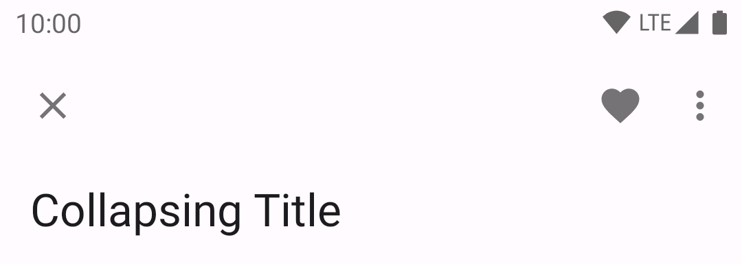
Collapsing top app bars
The larger collapsing top app bars can be used for longer titles, to house imagery, or to provide a stronger presence to the top app bar.
Medium top app bar example
The following example shows a Medium collapsing top app bar with a page title, a navigation icon, an action icon, and an overflow menu.
In the layout:
xml
<androidx.coordinatorlayout.widget.CoordinatorLayout
    ...>

    <com.google.android.material.appbar.AppBarLayout
        ...
        android:layout_width="match_parent"
        android:layout_height="wrap_content"
        android:fitsSystemWindows="true">

        <com.google.android.material.appbar.CollapsingToolbarLayout
            style="?attr/collapsingToolbarLayoutMediumStyle"
            android:layout_width="match_parent"
            android:layout_height="?attr/collapsingToolbarLayoutMediumSize">

            <com.google.android.material.appbar.MaterialToolbar
                ...
                android:layout_width="match_parent"
                android:layout_height="?attr/actionBarSize"
                android:elevation="0dp" />

        </com.google.android.material.appbar.CollapsingToolbarLayout>

    </com.google.android.material.appbar.AppBarLayout>

    ...

</androidx.coordinatorlayout.widget.CoordinatorLayout>
Large top app bar example
The following example shows a Large collapsing top app bar with a page title, a navigation icon, an action icon, and an overflow menu.

In the layout:
xml
<androidx.coordinatorlayout.widget.CoordinatorLayout
...>
<com.google.android.material.appbar.AppBarLayout
...
android:layout_width="match_parent"
android:layout_height="wrap_content"
android:fitsSystemWindows="true">
<com.google.android.material.appbar.CollapsingToolbarLayout
style="?attr/collapsingToolbarLayoutLargeStyle"
android:layout_width="match_parent"
android:layout_height="?attr/collapsingToolbarLayoutLargeSize">
<com.google.android.material.appbar.MaterialToolbar
android:layout_width="match_parent"
android:layout_height="?attr/actionBarSize"
...
android:elevation="0dp" />
</com.google.android.material.appbar.CollapsingToolbarLayout>
</com.google.android.material.appbar.AppBarLayout>
...
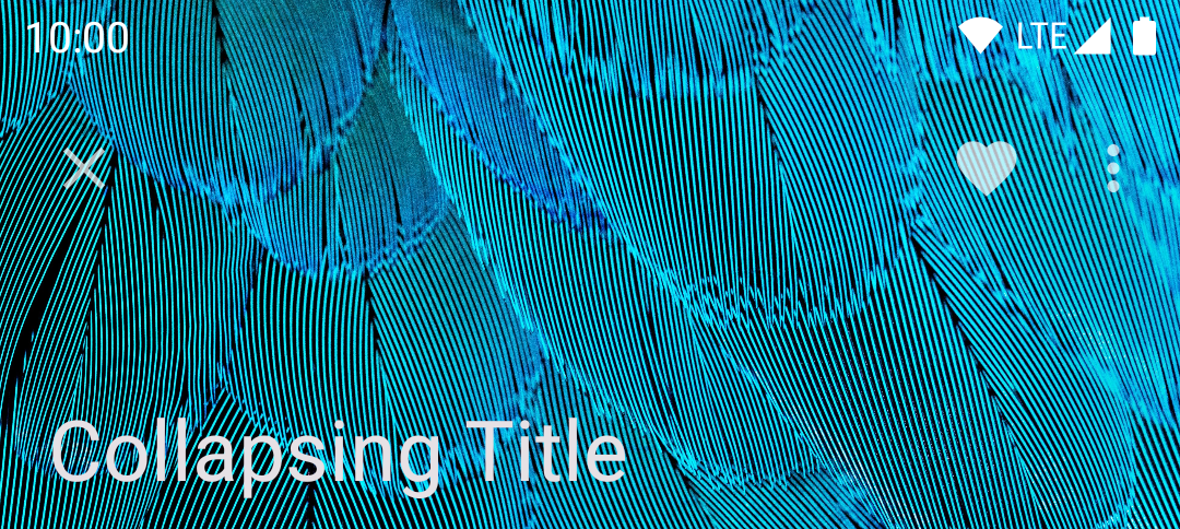
</androidx.coordinatorlayout.widget.CoordinatorLayout>Adding an image to a collapsing top app bar
A collapsing top app bar with an image background, a page title, a navigation icon, two action icons, and an overflow menu:
In the layout:
xml
<androidx.coordinatorlayout.widget.CoordinatorLayout
    ...
    android:fitsSystemWindows="true">

    <com.google.android.material.appbar.AppBarLayout
        ...
        android:layout_width="match_parent"
        android:layout_height="wrap_content"
        android:fitsSystemWindows="true">

        <com.google.android.material.appbar.CollapsingToolbarLayout
            style="?attr/collapsingToolbarLayoutLargeStyle"
            android:layout_width="match_parent"
            android:layout_height="?attr/collapsingToolbarLayoutLargeSize">

            <ImageView
                android:layout_width="match_parent"
                android:layout_height="match_parent"
                android:src="@drawable/media"
                android:scaleType="centerCrop"
                android:fitsSystemWindows="true"
                android:contentDescription="@string/content_description_media" />

            <com.google.android.material.appbar.MaterialToolbar
                android:layout_width="match_parent"
                android:layout_height="?attr/actionBarSize"
                ...
                android:background="@android:color/transparent" />

        </com.google.android.material.appbar.CollapsingToolbarLayout>

    </com.google.android.material.appbar.AppBarLayout>

    ...

</androidx.coordinatorlayout.widget.CoordinatorLayout>
In res/values/themes.xml:
xml
<style name="Theme.App" parent="Theme.Material3.*.NoActionBar">
    <item name="android:windowTranslucentStatus">true</item>
</style>
Applying scrolling behavior to a collapsing top app bar
When scrolling up, the collapsing top app bar transforms into a regular top app bar.
In the layout:
xml
<androidx.coordinatorlayout.widget.CoordinatorLayout
    ...>

    <com.google.android.material.appbar.AppBarLayout
        ...>

        <com.google.android.material.appbar.CollapsingToolbarLayout
            ...
            app:layout_scrollFlags="scroll|exitUntilCollapsed|snap"
            app:contentScrim="?attr/colorPrimary">

            ...

            <com.google.android.material.appbar.MaterialToolbar
                ...
                android:layout_height="?attr/actionBarSize"
                app:layout_collapseMode="pin"
                />

        </com.google.android.material.appbar.CollapsingToolbarLayout>

    </com.google.android.material.appbar.AppBarLayout>

    ...

</androidx.coordinatorlayout.widget.CoordinatorLayout>
Contextual action bar
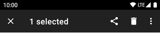
Contextual action bars provide actions for selected items. A top app bar can transform into a contextual action bar, remaining active until an action is taken or it is dismissed.
Contextual action bar example
API and source code:
ActionMode
The following example shows a contextual action bar with a contextual title, a close icon, two contextual action icons, and an overflow menu:
In res/values/themes.xml:
xml
<style name="Theme.App" parent="Theme.Material3.*.NoActionBar">
    ...
    <item name="windowActionModeOverlay">true</item>
    <item name="actionModeCloseDrawable">@drawable/ic_close_24dp</item>
    <item name="actionBarTheme">@style/ThemeOverlay.Material3.Dark.ActionBar</item>
</style>
In code:
kt
val callback = object : ActionMode.Callback {

    override fun onCreateActionMode(mode: ActionMode?, menu: Menu?): Boolean {
        menuInflater.inflate(R.menu.contextual_action_bar, menu)
        return true
    }

    override fun onPrepareActionMode(mode: ActionMode?, menu: Menu?): Boolean {
        return false
    }

    override fun onActionItemClicked(mode: ActionMode?, item: MenuItem?): Boolean {
        return when (item?.itemId) {
            R.id.share -> {
                // Handle share icon press
                true
            }
            R.id.delete -> {
                // Handle delete icon press
                true
            }
            R.id.more -> {
                // Handle more item (inside overflow menu) press
                true
            }
            else -> false
        }
    }

    override fun onDestroyActionMode(mode: ActionMode?) {
    }
}

val actionMode = startSupportActionMode(callback)
actionMode?.title = "1 selected"
In @menu/contextual_action_bar.xml:
xml
<menu xmlns:android="http://schemas.android.com/apk/res/android"
    xmlns:app="http://schemas.android.com/apk/res-auto">

    <item
        android:id="@+id/share"
        android:icon="@drawable/ic_share_24dp"
        android:title="@string/share"
        android:contentDescription="@string/content_description_share"
        app:showAsAction="ifRoom" />

    <item
        android:id="@+id/delete"
        android:icon="@drawable/ic_delete_24dp"
        android:title="@string/delete"
        android:contentDescription="@string/content_description_delete"
        app:showAsAction="ifRoom" />

    <item
        android:id="@+id/more"
        android:title="@string/more"
        android:contentDescription="@string/content_description_more"
        app:showAsAction="never" />

</menu>
In menu/navigation icons:
xml
<vector
    ...
    android:tint="?attr/colorControlNormal">
    ...
</vector>
Anatomy and Key properties
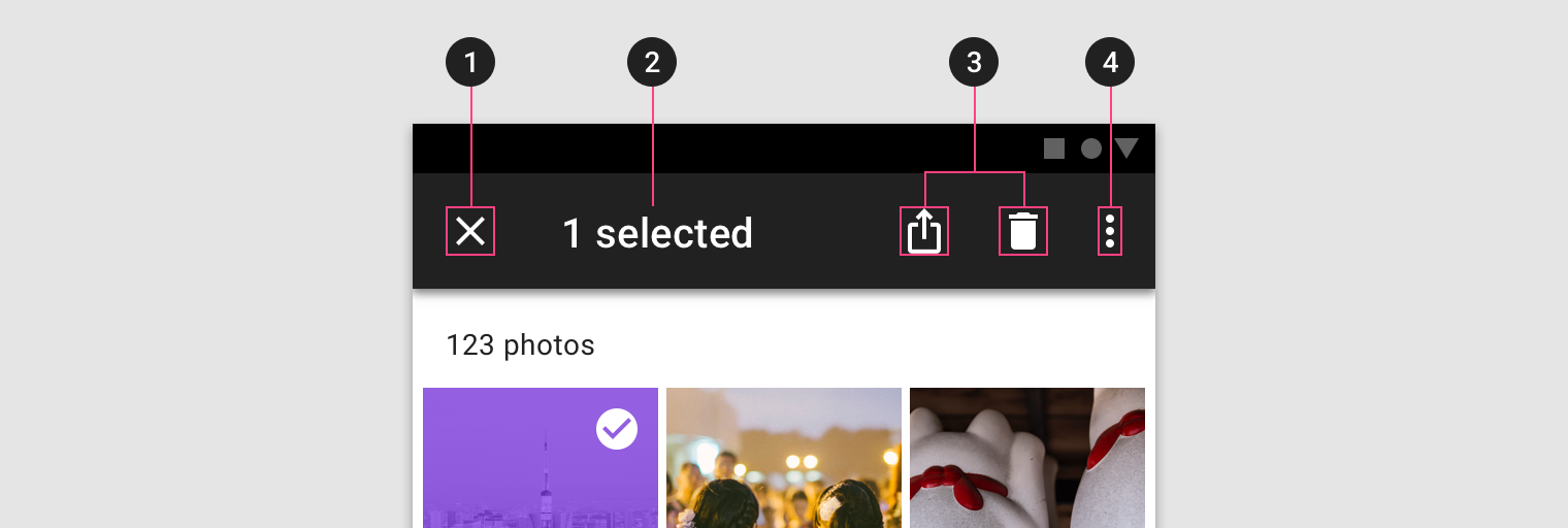
- Close button (instead of a navigation icon)
- Contextual title
- Contextual actions
- Overflow menu (optional)
- Container (not shown)
Close button attributes
| Element | Attribute | Related method(s) | Default value |
|---|---|---|---|
| Icon | app:actionModeCloseDrawable (in app theme) | N/A | @drawable/abc_ic_ab_back_material |
| Color | N/A | N/A | ?attr/colorControlNormal (as Drawable tint) |
Contextual title attributes
| Element | Attribute | Related method(s) | Default value |
|---|---|---|---|
| Title text | N/A | setTitlegetTitle | null |
| Subtitle text | N/A | setSubtitlegetSubtitle | null |
| Title typography | app:titleTextStyle | N/A | @style/TextAppearance.Material3.ActionBar.Title |
| Subtitle typography | app:subtitleTextStyle | N/A | @style/TextAppearance.Material3.ActionBar.Subtitle |
Contextual actions attributes
| Element | Attribute | Related method(s) | Default value |
|---|---|---|---|
| Menu | N/A | menuInflater.inflate in ActionMode.Callback | null |
| Icon color | N/A | N/A | ?attr/colorControlNormal (as Drawable tint) |
Overflow menu attributes
| Element | Attribute | Related method(s) | Default value |
|---|---|---|---|
| Icon | android:src and app:srcCompat in actionOverflowButtonStyle (in app theme) | setOverflowIcongetOverflowIcon | @drawable/abc_ic_menu_overflow_material (before API 23) or @drawable/ic_menu_moreoverflow_material (after API 23) |
| Overflow item typography | textAppearanceSmallPopupMenu and textAppearanceLargePopupMenu in app theme | N/A | ?attr/textAppearanceTitleMedium |
Container attributes
| Element | Attribute | Related method(s) | Default value |
|---|---|---|---|
| Color | app:background | N/A | ?attr/actionModeBackground |
| Height | app:height | N/A | ?attr/actionBarSize |
| Overlay window | app:windowActionModeOverlay (in app theme) | N/A | false |
Toolbar logo attributes
| Element | Attribute | Related method(s) | Default value |
|---|---|---|---|
| AdjustViewBounds | app:logoAdjustViewBounds | setLogoAdjustViewBoundsisLogoAdjustViewBounds | false |
| ScaleType | app:logoScaleType | setLogoScaleTypegetLogoScaleType | ImageView's default |
Styles
| Element | Style |
|---|---|
| Default style | Widget.Material3.ActionMode |
Default style theme attribute: actionModeStyle
Theming the top app bar
The top app bar supports Material Theming and can customize color, typography and shape.
Top app bar theming example
API and source code:
AppBarLayoutMaterialToolbar
A regular top app bar with Material Theming:
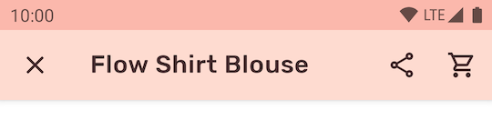
Implementing top app bar theming
Use theme attributes in res/values/styles.xml, which applies to all top app bars and affects other components:
xml
<style name="Theme.App" parent="Theme.Material3.*.NoActionBar">
    ...
    <item name="colorSurface">@color/shrine_pink_100</item>
    <item name="colorOnSurface">@color/shrine_pink_900</item>
    <item name="android:statusBarColor">?attr/colorPrimary</item>
    <item name="android:windowLightStatusBar" tools:targetApi="m">true</item>
    <item name="textAppearanceTitleLarge">@style/TextAppearance.App.TitleLarge</item>
    <item name="textAppearanceTitleMedium">@style/TextAppearance.App.TitleMedium</item>
</style>

<style name="TextAppearance.App.TitleLarge" parent="TextAppearance.Material3.TitleLarge">
    <item name="fontFamily">@font/rubik</item>
    <item name="android:fontFamily">@font/rubik</item>
</style>

<style name="TextAppearance.App.TitleMedium" parent="TextAppearance.Material3.TitleMedium">
    <item name="fontFamily">@font/rubik</item>
    <item name="android:fontFamily">@font/rubik</item>
</style>
Use default style theme attributes, styles and theme overlays, which applies to all top app bars but does not affect other components:
xml
<style name="Theme.App" parent="Theme.Material3.*.NoActionBar">
    ...
    <item name="toolbarStyle">@style/Widget.App.Toolbar</item>
</style>

<style name="Widget.App.Toolbar" parent="Widget.Material3.Toolbar">
    <item name="materialThemeOverlay">@style/ThemeOverlay.App.Toolbar</item>
    <item name="titleTextAppearance">@style/TextAppearance.App.TitleLarge</item>
    <item name="subtitleTextAppearance">@style/TextAppearance.App.TitleMedium</item>
</style>

<style name="ThemeOverlay.App.Toolbar" parent="">
    <item name="colorSurface">@color/shrine_pink_100</item>
    <item name="colorOnSurface">@color/shrine_pink_900</item>
</style>
Use the style in the layout, which affects only this top app bar:
xml
<com.google.android.material.appbar.MaterialToolbar
    ...
    app:title="@string/flow_shirt_blouse"
    app:menu="@menu/top_app_bar_shrine"
    app:navigationIcon="@drawable/ic_close_24dp"
    style="@style/Widget.App.Toolbar"
    />