Appearance
Navigation drawer
Navigation drawers provide access to destinations in your app.
Contents
- Design and API Documentation
- Using navigation drawers
- Anatomy
- Standard navigation drawer
- Modal navigation drawer
- Predictive Back
- Theming
Design and API Documentation
Using navigation drawers
Before you can use navigation drawers, you need to add a dependency to the Material Components for Android library. For more information, go to the getting started page. For modal navigation drawers you also need to add a dependency to the AndroidX DrawerLayout library. For more information go to the releases page.
The content of all navigation drawer types can be implemented using a NavigationView.
xml
<com.google.android.material.navigation.NavigationView
  android:id="@+id/navigationView"
  ... />
Note: The layout_width and layout_height attributes should be set to wrap_content, match_parent, or a custom dimension depending on the navigation drawer type and parent ViewGroup.
Adding a menu
In the layout:
xml
<com.google.android.material.navigation.NavigationView
    ...
    app:menu="@menu/navigation_drawer" />
In res/menu/navigation_drawer.xml:
xml
<menu ...>

  <item
    android:id="@+id/main_item"
    android:title="@string/mail_subheader_title">
      <menu>
        <item
          android:id="@+id/inbox_item"
          android:icon="@drawable/ic_inbox_24px"
          android:title="@string/inbox_title"
          android:checkable="true"/>
        <item
          android:id="@+id/outbox_item"
          android:icon="@drawable/ic_outbox_24px"
          android:title="@string/outbox_title"
          android:checkable="true"/>
        <item
          android:id="@+id/favourites_item"
          android:icon="@drawable/ic_favourites_24px"
          android:title="@string/favourites_title"
          android:checkable="true">
      </menu>
  </item>

</menu>
Adding a header
In the layout:
xml
<com.google.android.material.navigation.NavigationView
    ...
    app:headerLayout="@layout/header_navigation_drawer" />
In res/layout/header_navigation_drawer.xml:
xml
<LinearLayout
    ...
    android:layout_width="match_parent"
    android:layout_height="wrap_content"
    android:orientation="vertical">

    <TextView
        android:layout_width="wrap_content"
        android:layout_height="wrap_content"
        android:layout_marginTop="24dp"
        android:layout_marginStart="24dp"
        android:layout_marginEnd="24dp"
        android:textAppearance="?attr/textAppearanceHeadlineSmall"
        android:textColor="?attr/colorOnSurface"
        android:text="@string/header_title" />

    <TextView
        android:layout_width="wrap_content"
        android:layout_height="wrap_content"
        android:layout_marginBottom="24dp"
        android:layout_marginStart="24dp"
        android:layout_marginEnd="24dp"
        android:textAppearance="?attr/textAppearanceTitleSmall"
        android:textColor="?attr/colorOnSurfaceVariant"
        android:text="@string/header_text" />

</LinearLayout>
Adding dividers and subtitles
Dividers are automatically added between <item> groups with unique IDs or <group>s with unique IDs. When a sub-<menu> is added to an item it is treated as a subtitle.
In res/menu/navigation_drawer.xml:
xml
<menu ...>
  <item
    android:id="@+id/main_item"
    android:title="@string/mail_subheader_title">
      <menu>
        <item
          android:id="@+id/search_item"
          android:icon="@drawable/ic_search_24px"
          android:title="@string/search_title"
          android:checkable="true"
          app:showAsAction="ifRoom"/>
        <item
          android:id="@+id/rotation_item"
          android:icon="@drawable/ic_3d_rotation_24px"
          android:title="@string/3d_title"
          android:checkable="true"
          app:showAsAction="ifRoom"/>
        <item
          android:id="@+id/accelerator_item"
          android:icon="@drawable/ic_accelerator_24px"
          android:title="@string/accelerator_title"
          android:checkable="true"
          app:showAsAction="ifRoom"/>
        <item
          android:id="@+id/dashboard_item"
          android:icon="@drawable/ic_dashboard_24px"
          android:title="@string/dashboard_title"
          android:checkable="true"
          app:showAsAction="ifRoom"/>
      </menu>
  </item>
  <item
    android:id="@+id/labels_item"
    android:title="@string/labels_subheader_title">
      <menu>
        <item
          android:id="@+id/label_one"
          android:icon="@drawable/ic_label_24px"
          android:title="@string/label_one_title"
          android:checkable="true"
          app:showAsAction="ifRoom"/>
        <item
          android:id="@+id/label_two"
          android:icon="@drawable/ic_label_24px"
          android:title="@string/label_two_title"
          android:checkable="true"
          app:showAsAction="ifRoom"/>
      </menu>
  </item>

</menu>
Making navigation drawers accessible
Navigation drawers support content labeling for accessibility and are readable by most screen readers, such as TalkBack. Text rendered in menu items is automatically provided to accessibility services. Additional content labels are optional but recommended.
For more information on content labels, go to the Android accessibility help guide.
Content descriptions
A content description can be set on <item>s in the NavigationView menu so that screen readers like TalkBack are able to announce their purpose or action. This can be done in XML using the android:contentDescription attribute or programmatically with navigationView.menu.findItem(R.id.itemId)#setContentDescription (on API 26 and above).
Any ImageViews within the header layout should also have a content description set.
Opening and closing navigation drawers
To open navigation drawers, use clickable widgets that meet the minimum touch target size of 48dp and are properly labeled for accessibility. To close navigation drawers, consider doing the same but bear in mind that clicking on menu items or an optional scrim should also serve this purpose.
Using navigation drawers with the Navigation component
Navigation drawers can be used with the AndroidX Navigation library. For more information, go to the documentation.
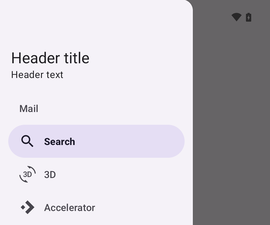
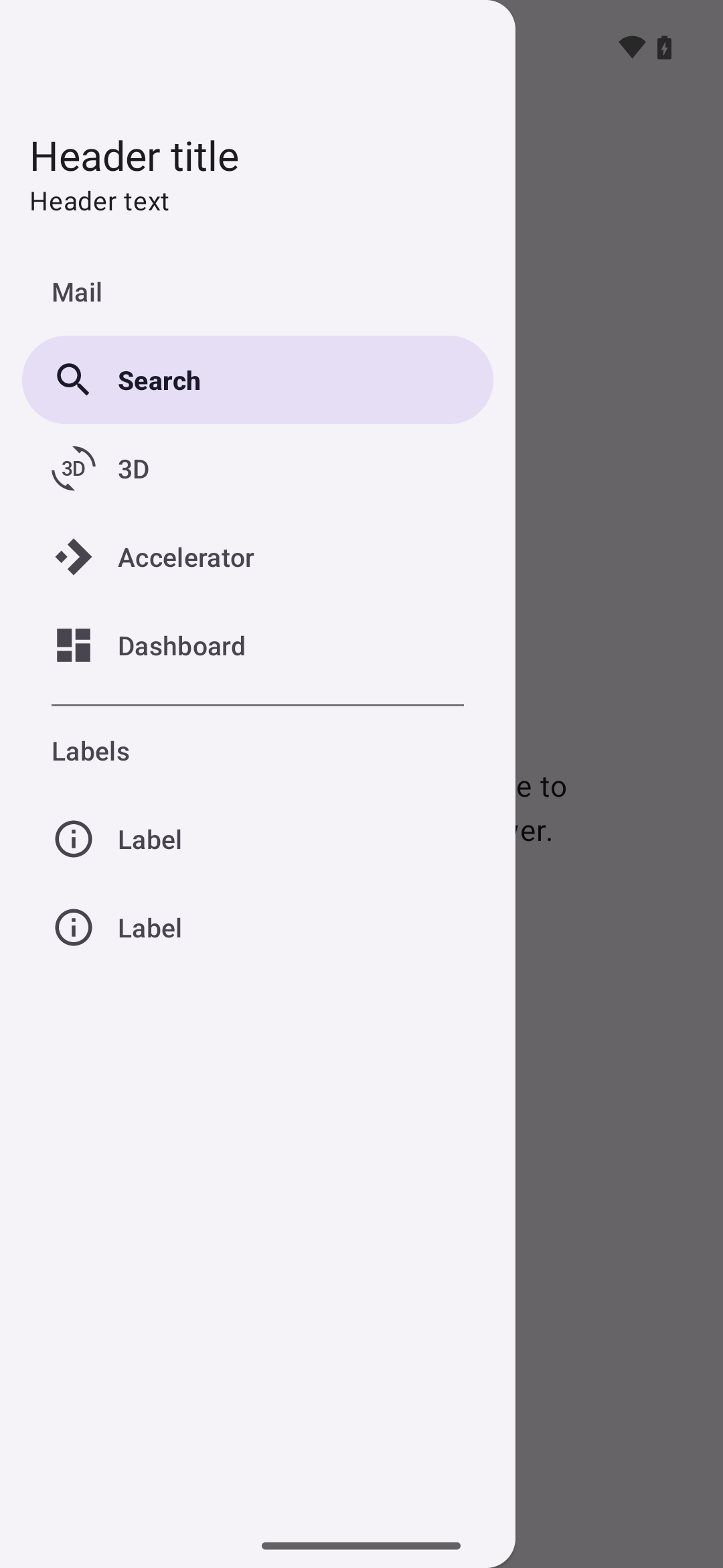
Anatomy
Navigation drawers have a container, an optional header, optional dividers, items with inactive text, active text, and an active text overlay, optional subtitles, and an optional scrim.
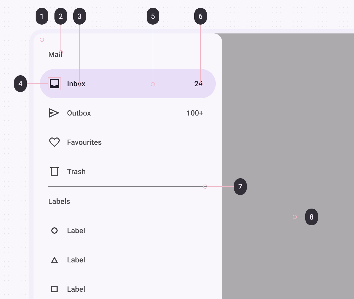
- Container
- Subheader (optional)
- Label text
- Icon (optional)
- Active indicator/Item shape
- Badge text (coming soon)
- Divider
- Scrim (modal drawer only)
Container attributes
| Element | Attribute(s) | Related method(s) | Default value |
|---|---|---|---|
| Color | android:background | setBackgroundgetBackground | ?attr/colorSurfaceContainerLow |
| Shape | app:shapeAppearanceapp:shapeAppearanceOverlay | N/A | null |
| Elevation | app:elevation (can be used on NavigationView or DrawerLayout) | setElevationgetElevation | 0dp (NavigationView) or 1dp (DrawerLayout) |
| Max width | android:maxWidth | N/A | 280dp |
| Fits system windows | android:fitsSystemWindows | setFitsSystemWindowsgetFitsSystemWindows | true |
| Drawer corner size | drawerLayoutCornerSize | N/A | 16dp |
Header attributes
| Element | Attribute | Related method(s) | Default value |
|---|---|---|---|
| Layout | app:headerLayout | addHeaderViewinflateHeaderViewgetHeaderViewgetHeaderCountremoveHeaderView | null |
Divider attributes
| Element | Attribute | Related method(s) | Default value |
|---|---|---|---|
| Divider | android:listDivider in app theme | N/A | Varies per platform version |
| Height | N/A (see layout) | N/A | 1dp |
| Inset | app:dividerInsetStartapp:dividerInsetEnd | setDividerInsetStartgetDividerInsetStartsetDividerInsetEndgetDividerInsetEnd | 28dp28dp |
Item attributes
| Element | Attribute(s) | Related method(s) | Default value |
|---|---|---|---|
| Color | app:itemShapeFillColor | N/A | ?attr/colorSecondaryContainer |
| Shape | app:itemShapeAppearanceapp:itemShapeAppearanceOverlay | N/A | @style/ShapeAppearance.Material3.Corner.Full ( ?attr/shapeCornerFamily and corner size 50%) |
| Insets | app:itemShapeInsetStartapp:itemShapeInsetTopapp:itemShapeInsetEndapp:itemShapeInsetBottom | N/A | 12dp0dp12dp0dp |
| Horizontal padding | app:itemHorizontalPadding | setItemHorizontalPaddingsetItemHorizontalPaddingResourcegetItemHorizontalPadding | 28dp |
| Vertical padding | app:itemVerticalPadding | setItemVerticalPaddingsetItemVerticalPaddingResourcegetItemVerticalPadding | 4dp |
Text attributes
| Element | Attribute | Related method(s) | Default value |
|---|---|---|---|
| Color | app:itemTextColor | setItemTextColorgetItemTextColor | ?attr/colorOnSecondaryContainer when active else ?attr/colorOnSurfaceVariant |
| Typography | app:itemTextAppearance | setItemTextAppearance | ?attr/textAppearanceLabelLarge |
| Typography (active) | app:itemTextAppearanceActiveBoldEnabled | setItemTextAppearanceActiveBoldEnabled | true |
| Max lines | app:itemMaxLines | setItemMaxLinesgetItemMaxLines | 1 |
Icon attributes
| Element | Attribute | Related method(s) | Default value |
|---|---|---|---|
| Color | app:itemIconTint | setIconItemTintListgetIconItemTintList | ?attr/colorOnSecondaryContainer when active else ?attr/colorOnSurfaceVariant |
| Size | app:itemIconSize | setItemIconSize | 24dp |
| Padding | app:itemIconPadding | setItemIconPaddingsetItemIconPaddingResourcegetItemIconPadding | 12dp |
Subtitle attributes
| Element | Attribute | Related method(s) | Default value |
|---|---|---|---|
| Color | app:subheaderColor | N/A | ?attr/colorOnSurfaceVariant |
| Typography | app:subheaderTextAppearance | N/A | ?attr/textAppearanceTitleSmall |
| Max lines | N/A | N/A | 1 |
| Height | N/A | N/A | ?attr/listPreferredItemHeightSmall |
| Padding | app:subheaderInsetStartapp:subheaderInsetEnd | setSubheaderInsetStartgetSubheaderInsetStartsetSubheaderInsetEndgetSubheaderInsetEnd | 28dp and 28dp |
Scrim attributes
| Element | Attribute | Related method(s) | Default value |
|---|---|---|---|
| Color | N/A | setScrimColor on DrawerLayout | Black at 60% opacity |
| Window Insets | app:topInsetScrimEnabledapp:bottomScrimEnabledapp:startScrimEnabledapp:endScrimEnabled | setTopInsetScrimEnabledisTopInsetScrimEnabledsetBottomInsetScrimEnabledisBottomInsetScrimEnabledsetStartInsetScrimEnabledisStartInsetScrimEnabledsetEndInsetScrimEnabledisEndInsetScrimEnabled | true |
NavigationView styles
| Element | Style |
|---|---|
| Default style | Widget.Material3.NavigationView |
Default style theme attribute: ?attr/navigationViewStyle
DrawerLayout styles
| Element | Style |
|---|---|
| Default style | Widget.Material3.DrawerLayout |
Default style theme attribute: ?attr/drawerLayoutStyle
Types
There are two types of navigation drawers: 1. Standard navigation drawer, 2. Modal navigation drawer
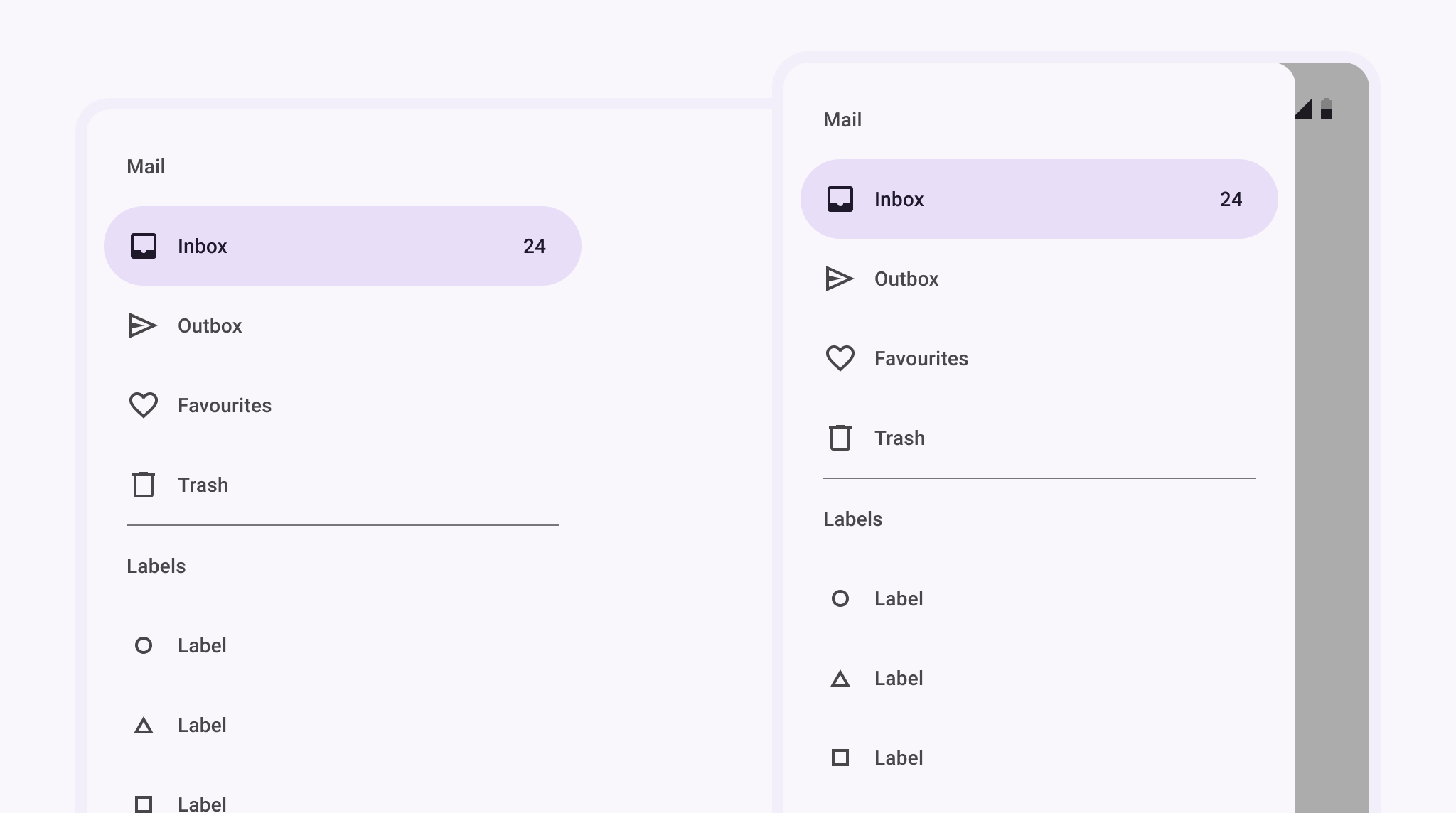
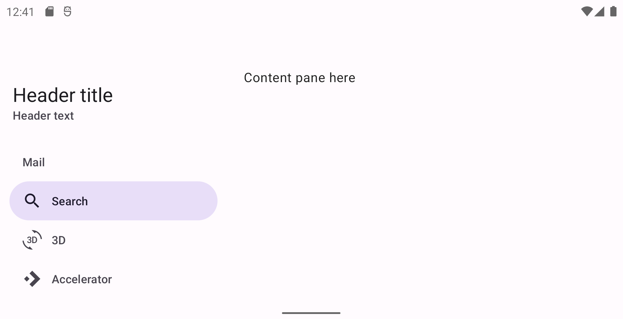
Standard navigation drawer
Standard navigation drawers allow interaction with both screen content and the drawer at the same time. They can be used on tablet and desktop, but they aren’t suitable for mobile devices due to limited screen size.
API and source code:
NavigationView
Standard navigation drawer example
The following example shows a permanently visible standard navigation drawer.
In the layout:
xml
<androidx.constraintlayout.widget.ConstraintLayout
    ...
    android:layout_width="match_parent"
    android:layout_height="match_parent">

    <com.google.android.material.navigation.NavigationView
        ...
        android:layout_width="wrap_content"
        android:layout_height="match_parent"
        app:layout_constraintStart_toStartOf="parent" />

    <!-- Screen content (constrained to end of navigationView) -->

</androidx.constraintlayout.widget.ConstraintLayout>
In res/values/themes.xml:
xml
<style name="Theme.App" parent="Theme.Material3.DayNight.*">
    <item name="android:windowTranslucentStatus">true</item>
</style>
In res/layout/header_navigation_drawer.xml:
xml
<LinearLayout
...
android:fitsSystemWindows="true">
...
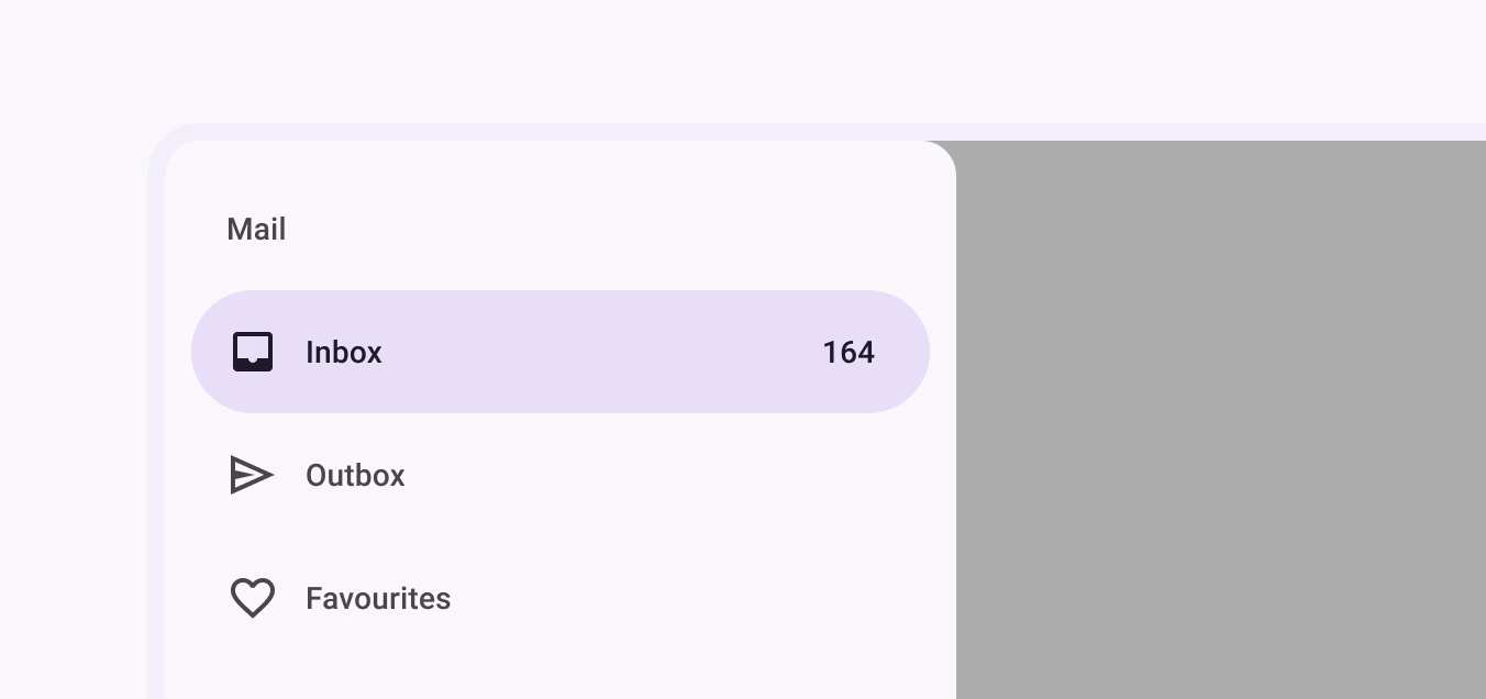
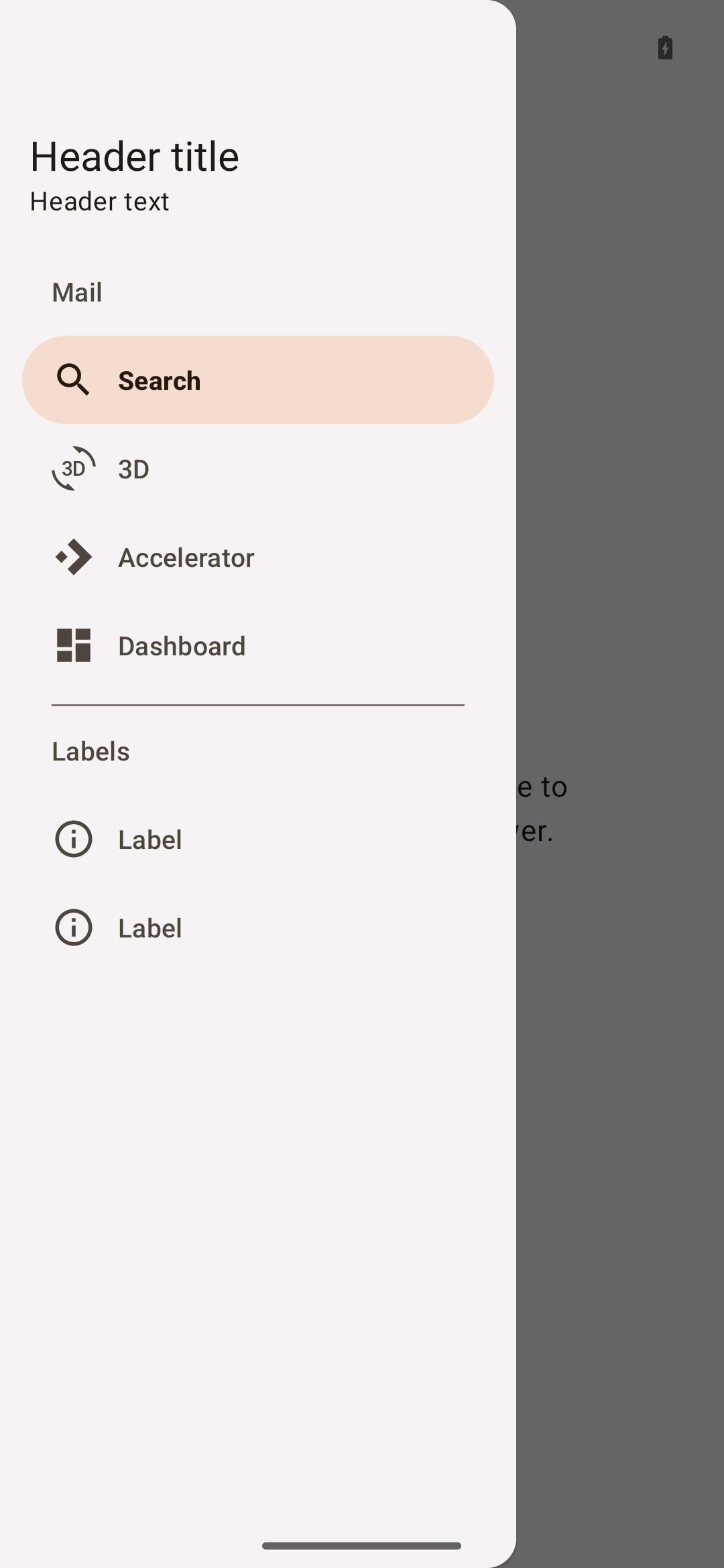
</LinearLayout>Modal navigation drawer
Modal navigation drawers block interaction with the rest of an app’s content with a scrim. They are elevated above most of the app’s UI and don’t affect the screen’s layout grid.
They are primarily used for mobile devices where screen space is limited, and can be replaced by standard drawers on tablet and desktop.
DrawerLayout is used in conjunction with NavigationDrawer to achieve the modal navigation drawer.
API and source code:
NavigationViewDrawerLayout
Modal navigation drawer example
The following example shows a modal navigation drawer.
In the layout:
xml
<androidx.drawerlayout.widget.DrawerLayout
    ...
    android:id="@+id/drawerLayout"
    android:layout_width="match_parent"
    android:layout_height="match_parent"
    tools:openDrawer="start">

    <androidx.coordinatorlayout.widget.CoordinatorLayout
        android:layout_width="match_parent"
        android:layout_height="match_parent"
        android:fitsSystemWindows="true">

        <!-- Screen content -->
        <!-- Use app:layout_behavior="@string/appbar_scrolling_view_behavior" to fit below top app bar -->

    </androidx.coordinatorlayout.widget.CoordinatorLayout>

    <com.google.android.material.navigation.NavigationView
        ...
        android:layout_width="wrap_content"
        android:layout_height="match_parent"
        android:layout_gravity="start" />

</androidx.drawerlayout.widget.DrawerLayout>
In res/values/themes.xml:
xml
<style name="Theme.App" parent="Theme.Material3.DayNight.*">
    <item name="android:windowTranslucentStatus">true</item>
</style>
In res/layout/header_navigation_drawer.xml:
xml
<LinearLayout
    ...
    android:fitsSystemWindows="true">

    ...

</LinearLayout>
In code:
kt
topAppBar.setNavigationOnClickListener {
    drawerLayout.open()
}

navigationView.setNavigationItemSelectedListener { menuItem ->
    // Handle menu item selected
    menuItem.isChecked = true
    drawerLayout.close()
    true
}
For more information on top app bars see the documentation.
Predictive Back
The NavigationView component automatically supports Predictive Back when it is set up within a DrawerLayout, as mentioned in the sections above. No further integration is required on the app side other than the general Predictive Back prerequisites and migration steps mentioned here.
Visit the Predictive Back design guidelines to see how the component behaves when a user swipes back.
Theming
Navigation drawers support Material Theming which can customize color, typography and shape.
Navigation drawer theming example
API and source code:
NavigationView
The following example shows a navigation drawer with Material Theming.
Implementing navigation drawer theming
Use theme attributes, default style theme attributes, and styles in res/values/styles.xml, which applies to all navigation drawers and affects other components:
xml
<style name="Theme.App" parent="Theme.Material3.*">
    ...
    <item name="colorSecondaryContainer">@color/shrine_theme_light_secondaryContainer</item>
    <item name="colorOnSecondaryContainer">@color/shrine_theme_light_onSecondaryContainer</item>
    <item name="colorTertiaryContainer">@color/shrine_theme_light_tertiaryContainer</item>
    <item name="colorOnTertiaryContainer">@color/shrine_theme_light_onTertiaryContainer</item>
    <item name="colorSurface">@color/shrine_theme_light_surface</item>
    <item name="colorOnSurface">@color/shrine_theme_light_onSurface</item>
    <item name="colorOnSurfaceVariant">@color/shrine_theme_light_onSurfaceVariant</item>
    <item name="colorOutline">@color/shrine_theme_light_outline</item>
    <item name="textAppearanceTitleSmall">@style/TextAppearance.App.TitleSmall</item>
    <item name="textAppearanceLabelLarge">@style/TextAppearance.App.LabelLarge</item>
</style>

<style name="TextAppearance.App.TitleSmall" parent="TextAppearance.Material3.TitleSmall">
    <item name="fontFamily">@font/rubik</item>
    <item name="android:fontFamily">@font/rubik</item>
</style>

<style name="TextAppearance.App.LabelLarge" parent="TextAppearance.Material3.LabelLarge">
    <item name="fontFamily">@font/rubik</item>
    <item name="android:fontFamily">@font/rubik</item>
</style>

<style name="Widget.App.NavigationView" parent="Widget.Material3.NavigationView">
    <item name="itemIconTint">@color/navigation_item_color</item>
    <item name="itemTextColor">@color/navigation_item_color</item>
    <item name="itemShapeFillColor">@color/navigation_item_background_color</item>
</style>
In res/color/navigation_item_color.xml:
xml
<selector ...>
    <item android:color="?attr/colorOnTertiaryContainer" android:state_checked="true"/>
    <item android:alpha="@dimen/material_emphasis_disabled" android:color="?attr/colorOnSurface" android:state_enabled="false"/>
    <item android:color="?attr/colorOnSurfaceVariant"/>
</selector>
In res/color/navigation_item_background_color.xml:
xml
<selector ...>
    <item android:alpha="@dimen/material_emphasis_disabled" android:color="?attr/colorTertiaryContainer" android:state_activated="true"/>
    <item android:alpha="@dimen/material_emphasis_disabled" android:color="?attr/colorTertiaryContainer" android:state_checked="true"/>
    <item android:color="@android:color/transparent"/>
</selector>
Use default style theme attributes, styles and theme overlays which apply to all navigation drawers but do not affect other components:
xml
<style name="Theme.App" parent="Theme.Material3.*">
    ...
    <item name="navigationViewStyle">@style/Widget.App.NavigationView</item>
</style>

<style name="Widget.App.NavigationView" parent="Widget.Material3.NavigationView">
    <item name="materialThemeOverlay">@style/ThemeOverlay.App.NavigationView</item>
    <item name="itemIconTint">@color/navigation_item_color</item>
    <item name="itemTextColor">@color/navigation_item_color</item>
    <item name="itemShapeFillColor">@color/navigation_item_background_color</item>
</style>

<style name="ThemeOverlay.App.NavigationView" parent="">
    <item name="colorSecondaryContainer">@color/shrine_theme_light_secondaryContainer</item>
    <item name="colorOnSecondaryContainer">@color/shrine_theme_light_onSecondaryContainer</item>
    <item name="colorTertiaryContainer">@color/shrine_theme_light_tertiaryContainer</item>
    <item name="colorOnTertiaryContainer">@color/shrine_theme_light_onTertiaryContainer</item>
    <item name="colorSurface">@color/shrine_theme_light_surface</item>
    <item name="colorOnSurface">@color/shrine_theme_light_onSurface</item>
    <item name="colorOnSurfaceVariant">@color/shrine_theme_light_onSurfaceVariant</item>
    <item name="colorOutline">@color/shrine_theme_light_outline</item>
    <item name="textAppearanceTitleSmall">@style/TextAppearance.App.TitleSmall</item>
    <item name="textAppearanceLabelLarge">@style/TextAppearance.App.LabelLarge</item>
</style>
Use the style in the layout, which affects only this navigation drawer:
xml
<com.google.android.material.navigation.NavigationView
    ...
    style="@style/Widget.App.NavigationView" />