Appearance
Progress indicators express an unspecified wait time or display the length of a process.
Contents
- Design and API Documentation
- Using progress indicators
- Linear progress indicators
- Circular progress indicators
- Anatomy and key properties
- Theming progress indicators
Design and API Documentation
Using progress indicators
Before you can use Material sliders, you need to add a dependency to the Material Components for Android library. For more information, go to the Getting started page.
Progress indicators inform users about the status of ongoing processes, such as loading an app, submitting a form, or saving updates. They communicate an app’s state and indicate available actions, such as whether users can navigate away from the current screen.
Note: When displaying progress for a sequence of processes, indicate overall progress rather than the progress of each activity.
Usage
A determinate progress indicator can be added to a layout:
xml
<!-- Linear progress indicator -->
<com.google.android.material.progressindicator.LinearProgressIndicator
    android:layout_width="match_parent"
    android:layout_height="wrap_content" />
<!-- Circular progress indicator -->
<com.google.android.material.progressindicator.CircularProgressIndicator
    android:layout_width="wrap_content"
    android:layout_height="wrap_content" />
An indeterminate progress indicator can be added:
xml
<!-- Linear progress indicator -->
<com.google.android.material.progressindicator.LinearProgressIndicator
    android:layout_width="match_parent"
    android:layout_height="wrap_content"
    android:indeterminate="true" />
<!-- Circular progress indicator -->
<com.google.android.material.progressindicator.CircularProgressIndicator
    android:layout_width="wrap_content"
    android:layout_height="wrap_content"
    android:indeterminate="true" />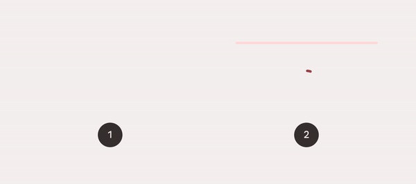
- Determinate
- Indeterminate
Switching from indeterminate to determinate
Indeterminate progress indicators can smoothly transit to determinate progress indicators by setting the progress programmatically:
kt
int progress = getLoadingProgress()
indicator.setProgressCompat(progress, true)
Note: Once indeterminate progress indicators are switched to the determinate mode (or initialized as determinate), they can be set back to indeterminate mode via calling the setIndeterminate(true) method.
Making progress indicators accessible
Progress indicators inherit accessibility support from the ProgressBar class in the framework. Please consider setting the content descriptor for use with screen readers.
That can be done in XML via the android:contentDescription attribute or programmatically like so:
kt
progressIndicator.contentDescription = contentDescriptionShowing/hiding the progress indicator
By default, the progress indicator will be shown or hidden without animations. You can change the animation behaviors via app:showAnimationBehavior (or setShowAnimationBehavior method) and app:hideAnimationBehavior (or setHideAnimationBehavior method).
The modes of behaviors are:
none(default) - shows/hides the view immediately when the visibility is being changed viashow,hideorsetVisibilitymethod.outward- for the linear type, shows the view by expanding from the baseline (or bottom edge) and hides the view by collapsing to the top edge; for the circular type, shows the view by expanding from the inner edge and hides the view by collapsing to the outer edge.inward- for the linear type, shows the view by expanding from the top edge and hides the view by collapsing to the baseline (bottom edge); for the circular type, shows the view by expanding from the outer edge and hides the view by collapsing to the inner edge.escape- for the linear type, escapes in the progression direction; for the circular type, no effect.
When the hide animation behavior is not none, the visibility of the view will be changed after the animation finishes. Please use setVisibilityAfterHide method to set the target visibility as Visibility.INVISIBLE (default) or Visibility.GONE.
Rounded corners
Progress indicators can have rounded corners via app:trackCornerRadius or the setTrackCornerRadius method.
Types
Material Design offers two visually distinct types of progress indicators: 1. linear 2. circular
Only one type should represent each kind of activity in an app. For example, if a refresh action displays a circular indicator on one screen, that same action shouldn’t use a linear indicator elsewhere in the app.
Linear progress indicators
Linear progress indicators display progress by animating an indicator along the length of a fixed, visible track. The behavior of the indicator is dependent on whether the progress of a process is known.
Linear progress indicators support both determinate and indeterminate operations.
- Determinate operations display the indicator increasing in width from 0 to 100% of the track, in sync with the process’s progress.
- Indeterminate operations display the indicator continually growing and shrinking along the track until the process is complete.
API and source code:
LinearProgressIndicator
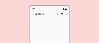
The following example shows a determinate linear progress indicator.
grey track" width="600"/>
In the layout:
xml
<com.google.android.material.progressindicator.LinearProgressIndicator
    android:layout_width="match_parent"
    android:layout_height="wrap_content" />
The following example shows an indeterminate linear progress indicator.
along grey track" width="600"/>
In the layout:
xml
<com.google.android.material.progressindicator.LinearProgressIndicator
    android:layout_width="match_parent"
    android:layout_height="wrap_content"
    android:indeterminate="true" />
Multi-color indeterminate animation type
For linear progress indicator, there are two indeterminate animation types:
disjoint- animates as repeated cycles with two disjoint segments in the
travels along track 2x then switches to yellow" width="600"/>
contiguous- animates as repeated cycles with three adjacent segments inanimation: red, yellow, blue indicators move sequentially and cover track" width="600"/>
Note: There is a minimum requirement of 3 indicator colors to use the contiguous animation. Otherwise, an IllegalArgumentException will be thrown.
Circular progress indicators
Circular progress indicators display progress by animating an indicator along an invisible circular track in a clockwise direction. They can be applied directly to a surface, such as a button or card.
Circular progress indicators support both determinate and indeterminate processes.
- Determinate circular indicators fill the invisible, circular track with color, as the indicator moves from 0 to 360 degrees.
- Indeterminate circular indicators grow and shrink in size while moving along the invisible track.
API and source code:
CircularProgressIndicator
The following example shows a determinate circular progress indicator.
circle clockwise from the top" width="600"/>
In the layout:
xml
<com.google.android.material.progressindicator.CircularProgressIndicator
    android:layout_width="wrap_content"
    android:layout_height="wrap_content" />
The following example shows an indeterminate circular progress indicator.
a circle clockwise from the top" width="600"/>
In the layout:
xml
<com.google.android.material.progressindicator.CircularProgressIndicator
    android:layout_width="wrap_content"
    android:layout_height="wrap_content"
    android:indeterminate="true" />
Anatomy and key properties
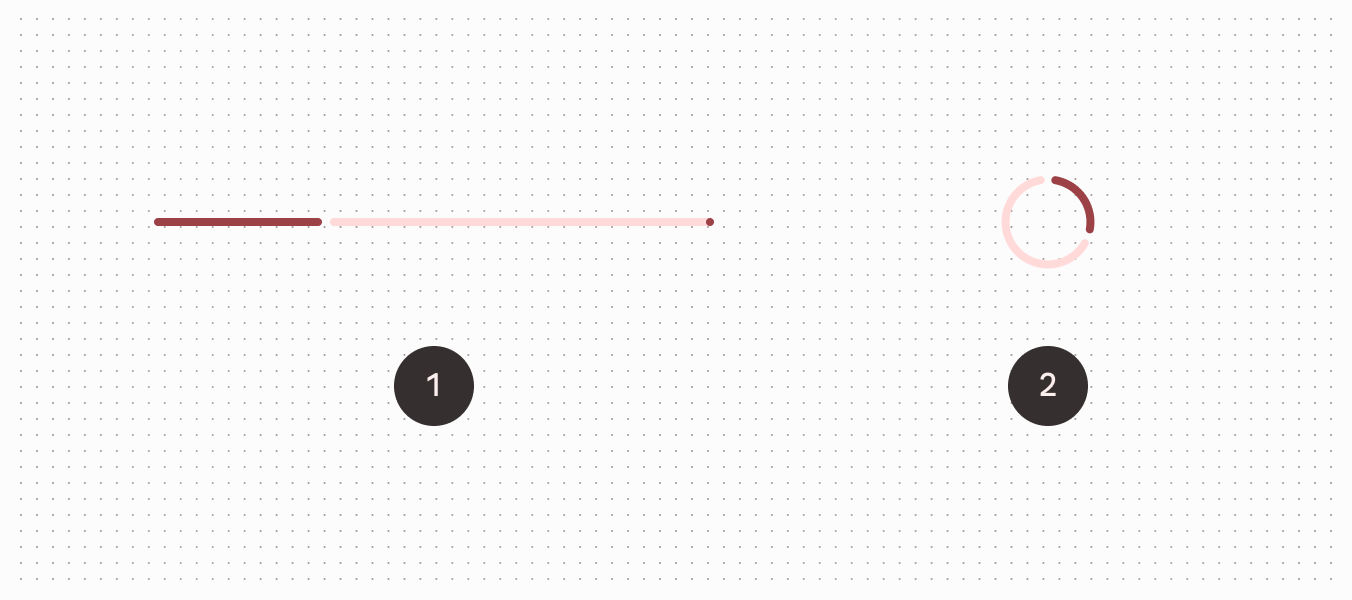
A progress indicator consists of a track and an indicator.
- Active indicator
- Track
- Stop indicator
Common attributes
The following attributes are shared between linear and circular progress indicators:
| Element | Attribute | Related method(s) | Default value |
|---|---|---|---|
| Track thickness | app:trackThickness | setTrackThicknessgetTrackThickness | 4dp |
| Indicator color | app:indicatorColor | setIndicatorColorgetIndicatorColor | colorPrimary |
| Track color | app:trackColor | setTrackColorgetTrackColor | colorPrimaryContainer (linear)@android:color/transparent (circular) |
| Track corner radius | app:trackCornerRadius | setTrackCornerRadiusgetTrackCornerRadius | 2dp |
| Indicator track gap size | app:indicatorTrackGapSize | setIndicatorTrackGapSizegetIndicatorTrackGapSize | 4dp |
| Show animation behavior | app:showAnimationBehavior | setShowAnimationBehaviorgetShowAnimationBehavior | none |
| Hide animation behavior | app:hideAnimationBehavior | setHideAnimationBehaviorgetHideAnimationBehavior | none |
| Delay (in ms) to show | app:showDelay | N/A | 0 |
| Min delay (in ms) to hide | app:minHideDelay | N/A | 0 |
| Wavelength | app:wavelength | setWavelength | 0 |
| Wavelength in determinate mode | app:wavelengthDeterminate | setWavelengthDeterminategetWavelenthDeterminate | wavelength |
| Wavelength in indeterminate mode | app:wavelengthIndeterminate | setWavelengthIndeterminategetWavelengthIndeterminate | wavelength |
| Wave amplitude | app:waveAmplitude | setWaveAmplitudegetWaveAmplitude | 0 |
| Wave speed | app:waveSpeed | setWaveSpeedgetWaveSpeed | 0 |
Linear type specific attributes
Linear type progress indicators also have the following attributes:
| Element | Attribute | Related method(s) | Default value |
|---|---|---|---|
| Indeterminate animation type | app:indeterminateAnimationType | setIndeterminateAnimationTypegetIndeterminateAnimationType | disjoint |
| Indicator direction | app:indicatorDirectionLinear | setIndicatorDirectiongetIndicatorDirection | leftToRight |
| Track stop indicator size | app:trackStopIndicatorSize | setTrackStopIndicatorSizegetTrackStopIndicatorSize | 4dp |
Circular type specific attributes
Circular type progress indicators also have the following attributes:
| Element | Attribute | Related method(s) | Default value |
|---|---|---|---|
| Spinner size (outer diameter) | app:indicatorSize | setIndicatorSizegetIndicatorSize | 40dp |
| Inset | app:indicatorInset | setIndicatorInsetgetIndicatorInset | 4dp |
| Indicator direction | app:indicatorDirectionCircular | setIndicatorDirectiongetIndicatorDirection | clockwise |
| Indeterminate animation type | app:indeterminateAnimationTypeCircular | setIndeterminateAnimationTypegetIndeterminateAnimationType | advance |
Styles
| Element | Style |
|---|---|
| Default linear style | Widget.Material3.LinearProgressIndicator |
| Default circular style | Widget.Material3.CircularProgressIndicator |
| Medium circular style | Widget.Material3.CircularProgressIndicator.Medium |
| Small circular style | Widget.Material3.CircularProgressIndicator.Small |
| Extra small circular style | Widget.Material3.CircularProgressIndicator.ExtraSmall |
Default linear style theme attribute: ?attr/linearProgressIndicatorStyle
Default circular style theme attribute: ?attr/circularProgressIndicatorStyle
See the full list of styles and attributes.
Non-Text Contrast update
In order to comply with the latest accessibility requirements, the LinearProgressIndicator and CircularProgressIndicator have been updated with additional attributes:
app:indicatorTrackGapSize: size of the gap between the indicator and the track, 4dp by default.app:trackStopIndicatorSize: size of the stop at the end of the track, 4dp by default. Only applies to the linear determinate configuration.
*.Legacy styles have been added to revert to the previous behavior (not recommended):
Widget.Material3.LinearProgressIndicator.LegacyWidget.Material3.CircularProgressIndicator.Legacy
Theming
Progress indicators support Material theming which can customize color and size.
Theming progress indicators
API and source code:
LinearProgressIndicatorCircularProgressIndicator
The following example shows a circular progress indicator with Material Theming.

Implementing progress indicator theming
Use theme attributes and styles in res/values/styles.xml, which applies to all circular progress indicators and affects other components:
xml
<style name="Theme.App" parent="Theme.Material3.*">
    ...
    <item name="colorPrimary">@color/shrine_pink_100</item>
</style>
Use a default type theme attribute, styles and a theme overlay, which applies to all circular progress indicators but does not affect other components:
xml
<style name="Theme.App" parent="Theme.Material3.*">
    ...
    <item name="circularProgressIndicatorStyle">@style/Widget.App.CircularProgressIndicator</item>
</style>

<style name="Widget.App.CircularProgressIndicator" parent="Widget.Material3.CircularProgressIndicator.Legacy">
    <item name="materialThemeOverlay">@style/ThemeOverlay.App.CircularProgressIndicator</item>
    <item name="trackThickness">20dp</item>
</style>

<style name="ThemeOverlay.App.CircularProgressIndicator" parent="">
    <item name="colorPrimary">@color/shrine_pink_100</item>
</style>
Use the style in the layout, which affects only this specific circular progress indicator:
xml
<com.google.android.material.progressindicator.CircularProgressIndicator
    ...
    style="@style/Widget.App.CircularProgressIndicator"  />