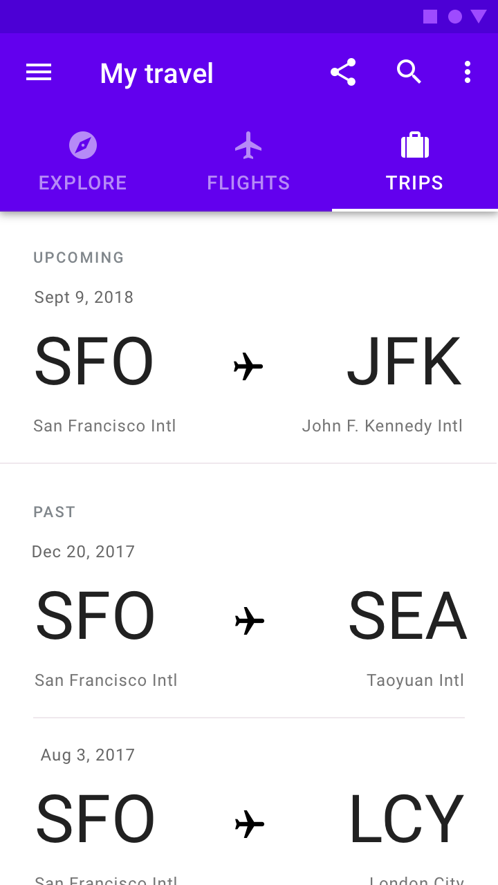
Appearance
Tabs
Tabs organize content across different screens, data sets, and other interactions.
Contents
Design and API Documentation
Using tabs
Before you can use Material tabs, you need to add a dependency to the Material Components for Android library. For more information, go to the Getting started page.
Basic usage
A TabLayout can be added to a layout:
xml
<com.google.android.material.tabs.TabLayout
    android:layout_width="match_parent"
    android:layout_height="wrap_content">

    ...

</com.google.android.material.tabs.TabLayout>TabItems can then be added as children of the TabLayout and adjusted as needed:
xml
<com.google.android.material.tabs.TabLayout
    ...>

    <com.google.android.material.tabs.TabItem
        android:layout_width="wrap_content"
        android:layout_height="wrap_content"
        android:text="@string/text_label_1"
        />

    <com.google.android.material.tabs.TabItem
        android:layout_width="wrap_content"
        android:layout_height="wrap_content"
        android:text="@string/text_label_2"
        />

    ...

</com.google.android.material.tabs.TabLayout>
Observe changes to tab selections:
kt
tabLayout.addOnTabSelectedListener(object : TabLayout.OnTabSelectedListener {

    override fun onTabSelected(tab: TabLayout.Tab?) {
        // Handle tab select
    }

    override fun onTabReselected(tab: TabLayout.Tab?) {
        // Handle tab reselect
    }

    override fun onTabUnselected(tab: TabLayout.Tab?) {
        // Handle tab unselect
    }
})
API and source code:
TabLayoutTabItem
Making tabs accessible
The Android tab components support screen reader descriptions for tabs and badges. While optional, we strongly encourage their use.
Content descriptions
Adding a content description to the entire TabLayout can be done in XML with the android:contentDescription attribute or programmatically:
kt
tabLayout.contentDescription = contentDescriptionContent descriptions can also be added to individual tabs:
kt
val tab = tabLayout.getTabAt(index)
tab?.contentDescription = contentDescription
BadgeDrawable also has a number of content description setters for different badge states:
kt
val badge = tab.getOrCreateBadge()

// For badges with a number
badge.setContentDescriptionNumberless(contentDescription)
badge.setContentDescriptionQuantityStringsResource(R.string.content_description)
badge.setContentDescriptionExceedsMaxBadgeNumberStringResource(R.string.content_description)

// For badges with a text
badge.setContentDescriptionForText(contentDescription)
Using tabs with ViewPager
A TabLayout can be set up with a ViewPager in order to:
- Dynamically create
TabItems based on the number of pages, their titles, etc. - Synchronize the selected tab and tab indicator position with page swipes
First, your PagerAdapter (or subclass) needs to override the getPageTitle function in order to set the tab text label:
kt
class Adapter : PagerAdapter() {

    ...

    override fun getPageTitle(position: Int): CharSequence? {
        // Return tab text label for position
    }
}
After the adapter has been set on the ViewPager, synchronize the TabLayout:
kt
tabLayout.setupWithViewPager(viewPager)Further customization of the dynamically-created TabItems (such as setting icons) needs to be done separately:
kt
val tab = tabLayout.getTabAt(index)
tab?.icon = drawable
Using tabs with ViewPager2
Setting up a TabLayout with a ViewPager2 relies on the same concepts as doing so with a ViewPager, but the implementation is different. Everything is handled by the TabLayoutMediator class:
kt
TabLayoutMediator(tabLayout, viewPager2) { tab, position ->
    when (position) {
        0 -> {
            tab.text = textLabel1
            tab.icon = drawable1
        }
        1 -> {
            tab.text = textLabel2
            tab.icon = drawable2
        }
        ...
    }
}.attach()
Adding badges to tabs
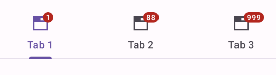
Tabs support badging with the BadgeDrawable class:
kt
// Get badge from tab (or create one if none exists)
val badge = tab.getOrCreateBadge()
// Customize badge
badge.number = number
// Remove badge from tab
tab.removeBadge()
Types
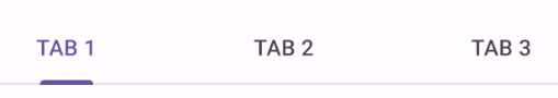
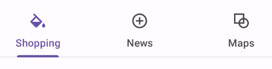
There are two types of tabs: 1. Fixed tabs, 2. Scrollable tabs
Fixed tabs
Fixed tabs display all tabs on one screen, with each tab at a fixed width. The width of each tab is determined by dividing the number of tabs by the screen width. They don’t scroll to reveal more tabs; the visible tab set represents the only tabs available.
Fixed tabs example
The following example shows a row of fixed tabs.
In the layout:
xml
<com.google.android.material.tabs.TabLayout
android:layout_width="match_parent"
android:layout_height="wrap_content"
app:tabMode="fixed">
<com.google.android.material.tabs.TabItem
android:layout_width="wrap_content"
android:layout_height="wrap_content"
android:text="@string/tab_1"
android:icon="@drawable/ic_favorite_24dp"
/>
<com.google.android.material.tabs.TabItem
android:layout_width="wrap_content"
android:layout_height="wrap_content"
android:text="@string/tab_2"
android:icon="@drawable/ic_music_24dp"
/>
<com.google.android.material.tabs.TabItem
android:layout_width="wrap_content"
android:layout_height="wrap_content"
android:text="@string/tab_3"
android:icon="@drawable/ic_search_24dp"
/>
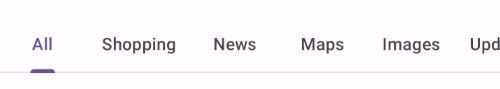
</com.google.android.material.tabs.TabLayout>Scrollable tabs
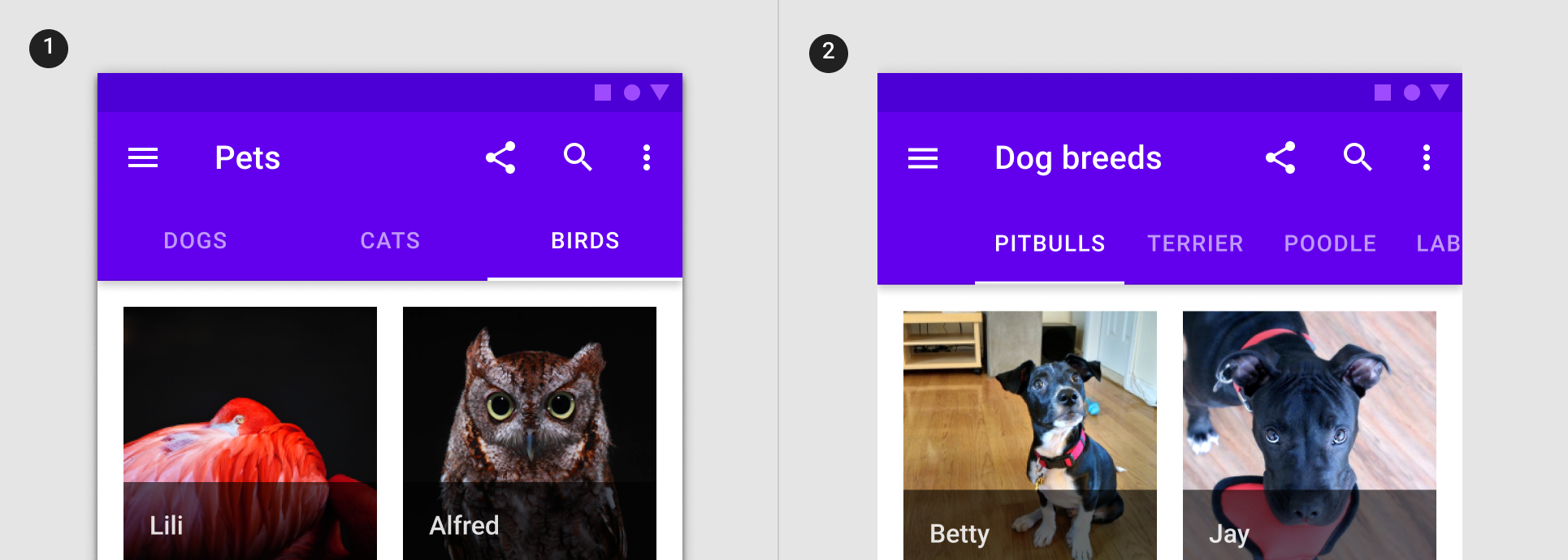
Scrollable tabs are displayed without fixed widths. They are scrollable, such that some tabs will remain off-screen until scrolled.
Scrollable tabs example
The following example shows a row of scrollable tabs.
In the layout:
xml
<com.google.android.material.tabs.TabLayout
    android:layout_width="match_parent"
    android:layout_height="wrap_content"
    app:tabMode="scrollable"
    app:tabContentStart="56dp">

    <com.google.android.material.tabs.TabItem
        android:layout_width="wrap_content"
        android:layout_height="wrap_content"
        android:text="@string/tab_1"
        />

    <com.google.android.material.tabs.TabItem
        android:layout_width="wrap_content"
        android:layout_height="wrap_content"
        android:text="@string/tab_2"
        />

    <com.google.android.material.tabs.TabItem
        android:layout_width="wrap_content"
        android:layout_height="wrap_content"
        android:text="@string/tab_3"
        />

    <com.google.android.material.tabs.TabItem
        android:layout_width="wrap_content"
        android:layout_height="wrap_content"
        android:text="@string/tab_4"
        />

    <com.google.android.material.tabs.TabItem
        android:layout_width="wrap_content"
        android:layout_height="wrap_content"
        android:text="@string/tab_5"
        />
    ...
</com.google.android.material.tabs.TabLayout>
Anatomy and key properties
Tabs have a container and each tab item has an optional icon and text label. Tab items can be in an active or inactive state. The tab indicator is shown below the active tab item.
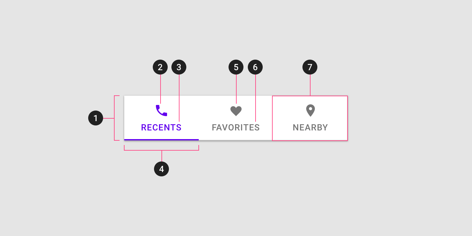
- Container
- Active icon (optional if there’s a label)
- Active text label (optional if there’s an icon)
- Active tab indicator
- Inactive icon (optional if there’s a label)
- Inactive text label (optional if there’s an icon)
- Tab item
Container attributes
| Element | Attribute | Related method(s) | Default value |
|---|---|---|---|
| Color | android:background | setBackgroundgetBackground | ?attr/colorOnSurfaceVariant |
| Elevation | android:elevation | setElevation | 0dp |
| Height | N/A | N/A | 48dp (inline text) or 72dp (non-inline text and icon) |
| Tab mode | tabMode | setTabModegetTabMode | fixed |
Tab item icon attributes
| Element | Attribute | Related method(s) | Default value |
|---|---|---|---|
| Icon | android:icon | setIcongetIcon | null |
| Color | tabIconTint | setTabIconTintsetTabIconTintResourcegetTabIconTint | colorOnSurfaceVariant and colorPrimary (activated) (see all states) |
Tab item text label attributes
| Element | Attribute | Related method(s) | Default value |
|---|---|---|---|
| Text | android:text | setTextgetText | null |
| Color | tabTextColor | setTabTextColorsgetTabTextColors | colorOnSurfaceVariant and colorPrimary (activated) (see all states) |
| Typography | tabTextAppearance | N/A | ?attr/textAppearanceTitleSmall |
| Active tab typography | tabSelectedTextAppearance | N/A | None; will use tabTextAppearance instead |
| Inline label | tabInlineLabel | setInlineLabelsetInlineLabelResourceisInlineLabel | false |
Note: When using tabSelectedTextAppearance, you must have matching text attributes in tabTextAppearance to avoid unintended behavior.
Tab item container attributes
| Element | Attribute | Related method(s) | Default value |
|---|---|---|---|
| Ripple color | tabRippleColor | setTabRippleColorsetTabRippleColorResourcegetTabRippleColor | colorOnSurfaceVariant at 16% opacity and colorPrimary at 16% opacity (activated) (see all states) |
| Unbounded ripple | tabUnboundedRipple | setUnboundedRipplesetUnboundedRippleResourcehasUnboundedRipple | true |
| Gravity | tabGravity | setTabGravitygetTabGravity | fill |
| Min width | tabMinWidth | N/A | 72dp (scrollable) or wrap_content |
| Max width | tabMaxWidth | N/A | 264dp |
| Padding | tabPaddingStarttabPaddingEndtabPaddingToptabPaddingBottomtabPadding | N/A | 12dp12dp0dp0dp0dp |
Tab indicator attributes
| Element | Attribute | Related method(s) | Default value |
|---|---|---|---|
| Color | tabIndicatorColor | setSelectedTabIndicatorColor | colorPrimary |
| Drawable | tabIndicator | setSelectedTabIndicatorgetSelectedTabIndicator | m3_tabs_rounded_line_indicator |
| Height | tabIndicatorHeight | setSelectedTabIndicatorHeight | 2dp |
| Full width | tabIndicatorFullWidth | setTabIndicatorFullWidthisTabIndicatorFullWidth | false |
| Animation mode | tabIndicatorAnimationMode | setTabIndicatorAnimationModegetTabIndicatorAnimationMode | elastic |
| Gravity | tabIndicatorGravity | setSelectedTabIndicatorGravitygetTabIndicatorGravity | bottom |
| Animation duration | tabIndicatorAnimationDuration | N/A | 250 |
Styles
| Element | Style |
|---|---|
| Default style | Widget.Material3.TabLayout |
| Style for elevateable surfaces | Widget.Material3.TabLayout.OnSurface |
| Primary secondary color style | Widget.Material3.TabLayout.Secondary |
Default style theme attribute: ?attr/tabStyle
Additional style theme attributes: ?attr/tabSecondaryStyle
See the full list of styles and attrs.
Theming tabs
Tabs support Material Theming which can customize color and typography.
Tabs theming example
API and source code:
TabLayoutTabItem
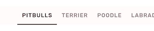
The following example shows a row of scrollable tabs with Material Theming.
Implementing tabs theming
Use theme attributes and styles in res/values/styles.xml which applies to all tabs and affects other components:
xml
<style name="Theme.App" parent="Theme.Material3.*">
    ...
    <item name="colorPrimary">@color/shrine_pink_900</item>
    <item name="colorSurface">@color/shrine_pink_light</item>
    <item name="colorOnSurface">@color/shrine_pink_900</item>
    <item name="textAppearanceLabelLarge">@style/TextAppearance.App.LabelLarge</item>
</style>

<style name="TextAppearance.App.LabelLarge" parent="TextAppearance.Material3.LabelLarge">
    <item name="fontFamily">@font/rubik</item>
    <item name="android:fontFamily">@font/rubik</item>
</style>
Use default style theme attributes, styles and theme overlays, which apply to all tabs but do not affect other components:
xml
<style name="Theme.App" parent="Theme.Material3.*">
    ...
    <item name="tabStyle">@style/Widget.App.LabelLarge</item>
</style>

<style name="Widget.App.TabLayout" parent="Widget.Material3.TabLayout">
    <item name="materialThemeOverlay">@style/ThemeOverlay.App.TabLayout</item>
    <item name="tabTextAppearance">@style/TextAppearance.App.LabelLarge</item>
</style>

<style name="ThemeOverlay.App.TabLayout" parent="">
    <item name="colorPrimary">@color/shrine_pink_900</item>
    <item name="colorSurface">@color/shrine_pink_light</item>
    <item name="colorOnSurface">@color/shrine_pink_900</item>
</style>
Use the style in the layout, which affects only these tabs:
xml
<com.google.android.material.tabs.TabLayout
    ...
    style="@style/Widget.App.TabLayout"
    />