Appearance
Cards
Cards contain content and actions about a single subject.
Contents
Design and API Documentation
Using cards
Before you can use a Material card, you need to add a dependency to the Material Components for Android library. For more information, go to the Getting started page.
Cards support checking and dragging, but those behaviors are not implemented by default.
Making cards accessible
The contents within a card should follow their own accessibility guidelines, such as images having content descriptions set on them.
If you have a draggable card, you should set an AccessibilityDelegate on it, so that the behavior can be accessible via screen readers such as TalkBack. See the draggable card section below for more info.
Making a card checkable
When a card is checked, it will show a checked icon and change its foreground color. There is no default behavior for enabling/disabling the checked state. An example of how to do it in response to a long click is shown below.
In the layout:
xml
<com.google.android.material.card.MaterialCardView
    ...
    android:clickable="true"
    android:focusable="true"
    android:checkable="true">

    ...

</com.google.android.material.card.MaterialCardView>
In code:
kt
card.setOnLongClickListener {
    card.setChecked(!card.isChecked)
    true
}
Making a card draggable
Cards have an app:state_dragged with foreground and elevation changes to convey motion. We recommend using ViewDragHelper to set the dragged state:
kt
private inner class ViewDragHelperCallback : ViewDragHelper.Callback() {

    override fun onViewCaptured(capturedChild: View, activePointerId: Int) {
        if (capturedChild is MaterialCardView) {
            (view as MaterialCardView).setDragged(true)
        }
    }

    override fun onViewReleased(releaseChild: View, xVel: Float, yVel: Float) {
        if (releaseChild is MaterialCardView) {
            (view as MaterialCardView).setDragged(false)
        }
    }
}
Alternatively, the Material Catalog has an implementation example that you can copy, which uses a custom class called DraggableCoordinatorLayout. It is used as the parent container in the layout:
In the layout:
xml
<io.material.catalog.draggable.DraggableCoordinatorLayout
    android:id="@+id/parentContainer"
    ...>

    <com.google.android.material.card.MaterialCardView
        ...>

        ...

    </com.google.android.material.card.MaterialCardView>

</io.material.catalog.draggable.DraggableCoordinatorLayout>
In code:
kt
parentContainer.addDraggableChild(card)

parentContainer.setViewDragListener(object : DraggableCoordinatorLayout.ViewDragListener {

    override fun onViewCaptured(view: View, pointerId: Int) {
        card.isDragged = true
    }

    override fun onViewReleased(view: View, vX: Float, vY: Float) {
        card.isDragged = false
    }
})
Finally, make sure the behavior is accessible by setting an AccessibilityDelegate on the card. The code below demonstrates how to allow the user to move the card to two different positions on the screen.
kt
private val cardDelegate = object : AccessibilityDelegate() {
    override fun onInitializeAccessibilityNodeInfo(host: View, info: AccessibilityNodeInfo) {
        super.onInitializeAccessibilityNodeInfo(host, info)

        val layoutParams = card!!.layoutParams as CoordinatorLayout.LayoutParams
        val gravity = layoutParams.gravity
        val isOnTop = gravity and Gravity.TOP == Gravity.TOP
        val isOnBottom = gravity and Gravity.BOTTOM == Gravity.BOTTOM

        if (!isOnTop) {
            info.addAction(AccessibilityAction(R.id.move_card_top_action, getString(R.string.card_action_move_top)))
        }
        if (!isOnBottom) {
            info.addAction(AccessibilityAction(R.id.move_card_bottom_action, getString(R.string.card_action_move_bottom)))
        }
    }

    override fun performAccessibilityAction(host: View, action: Int, arguments: Bundle): Boolean {
        val gravity: Int
        if (action == R.id.move_card_top_action) {
            gravity = Gravity.TOP
        } else if (action == R.id.move_card_bottom_action) {
            gravity = Gravity.BOTTOM
        } else {
            return super.performAccessibilityAction(host, action, arguments)
        }

        val layoutParams = card!!.layoutParams as CoordinatorLayout.LayoutParams
        if (layoutParams.gravity != gravity) {
            layoutParams.gravity = gravity
            card!!.requestLayout()
        }

        return true
    }
}
Note: Cards also support a swipe-to-dismiss behavior through the use of 'SwipeDismissBehavior'. You can see an example here.
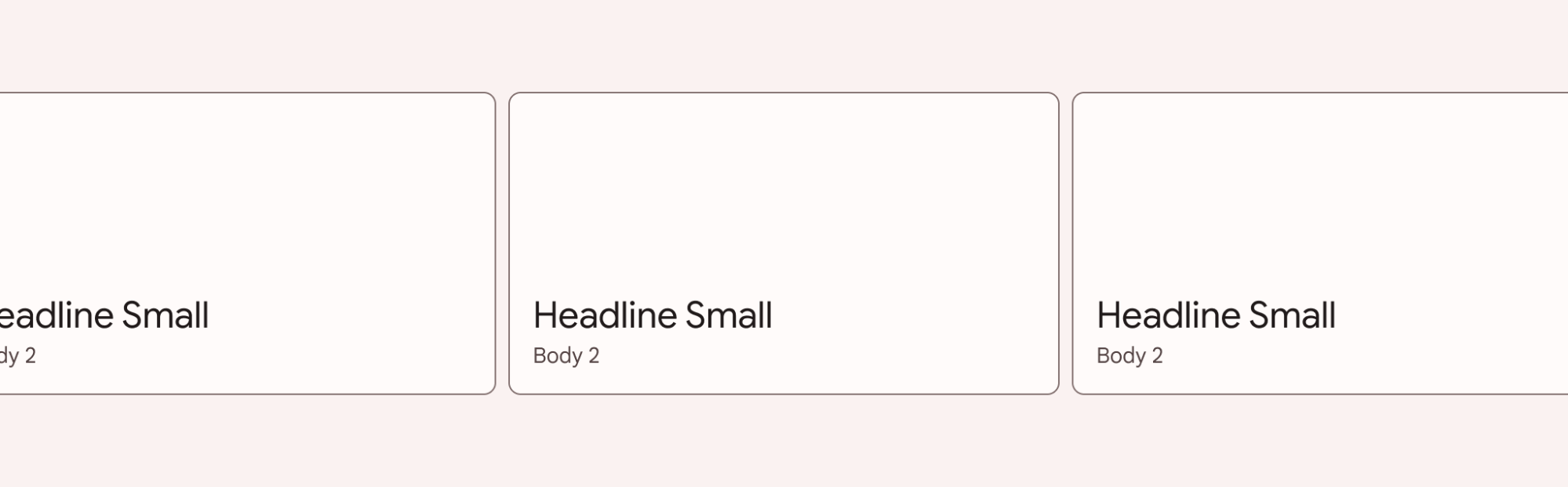
Card
On mobile, an outlined or a filled card’s default elevation is 0dp, with a raised dragged elevation of 8dp. The Material Android library also provides an elevated card style, which has an elevation of 1dp, with a raised dragged elevation of 2dp.
Card examples
API and source code:
MaterialCardView
Note: You don't need to specify a style tag as long as you are using a Material Components Theme. If not, set the style to Widget.Material3.CardView.Outlined, Widget.Material3.CardView.Filled or Widget.Material3.CardView.Elevated.
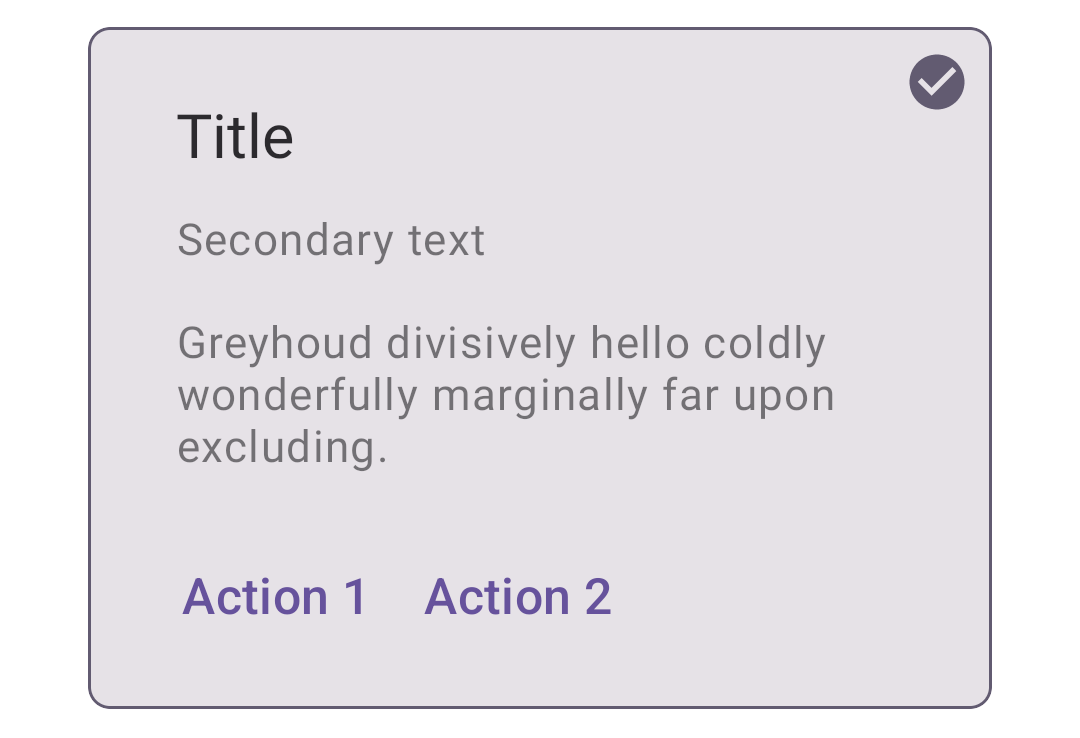
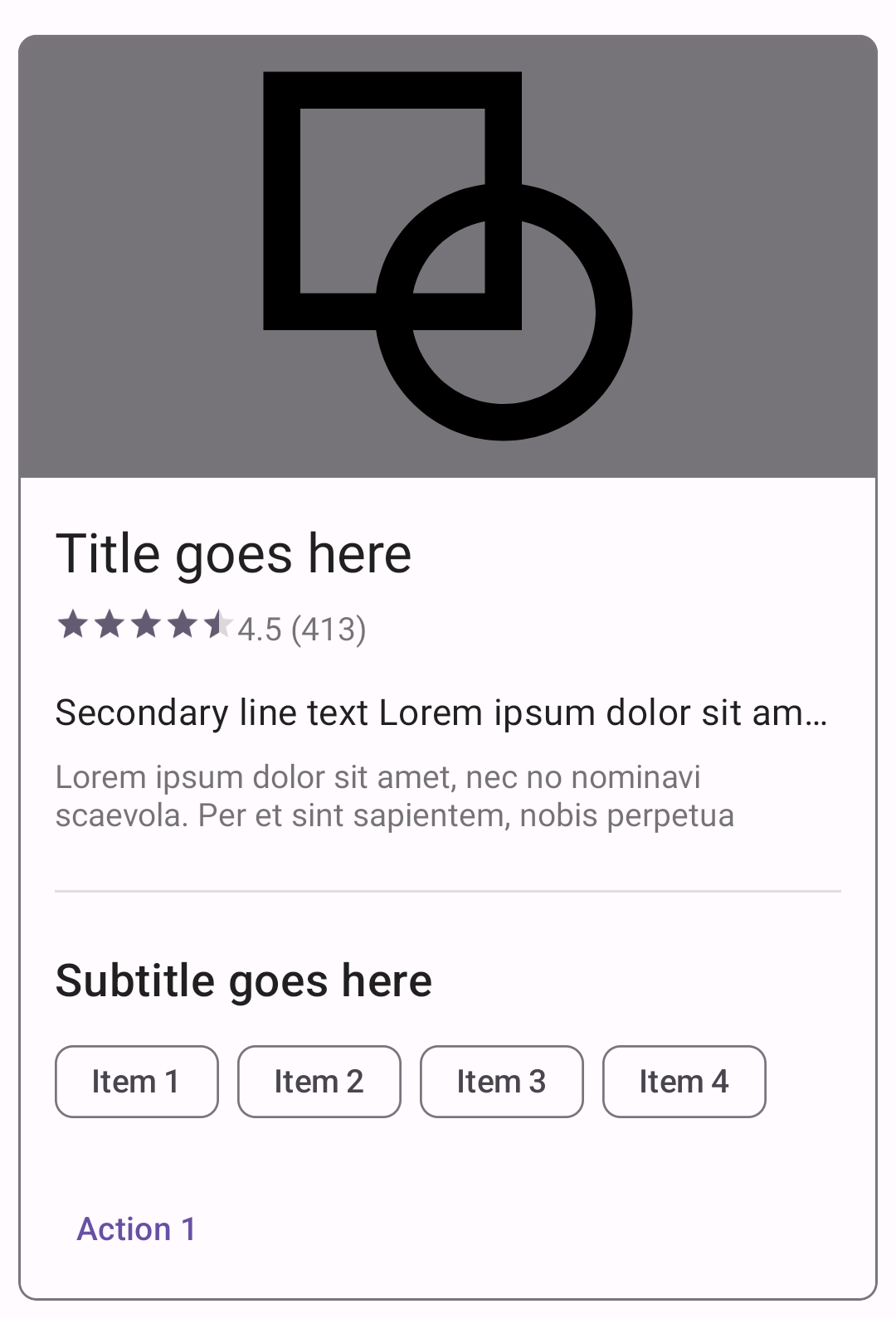
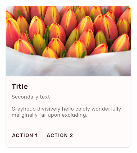
Outlined card
The following example shows an outlined card.
xml
<com.google.android.material.card.MaterialCardView
android:id="@+id/card"
android:layout_width="match_parent"
android:layout_height="wrap_content"
android:layout_margin="8dp">
<LinearLayout
android:layout_width="match_parent"
android:layout_height="wrap_content"
android:orientation="vertical">
<!-- Media -->
<ImageView
android:layout_width="match_parent"
android:layout_height="194dp"
app:srcCompat="@drawable/media"
android:scaleType="centerCrop"
android:contentDescription="@string/content_description_media"
/>
<LinearLayout
android:layout_width="match_parent"
android:layout_height="wrap_content"
android:orientation="vertical"
android:padding="16dp">
<!-- Title, secondary and supporting text -->
<TextView
android:layout_width="wrap_content"
android:layout_height="wrap_content"
android:text="@string/title"
android:textAppearance="?attr/textAppearanceTitleMedium"
/>
<TextView
android:layout_width="wrap_content"
android:layout_height="wrap_content"
android:layout_marginTop="8dp"
android:text="@string/secondary_text"
android:textAppearance="?attr/textAppearanceBodyMedium"
android:textColor="?android:attr/textColorSecondary"
/>
<TextView
android:layout_width="wrap_content"
android:layout_height="wrap_content"
android:layout_marginTop="16dp"
android:text="@string/supporting_text"
android:textAppearance="?attr/textAppearanceBodyMedium"
android:textColor="?android:attr/textColorSecondary"
/>
</LinearLayout>
<!-- Buttons -->
<LinearLayout
android:layout_width="wrap_content"
android:layout_height="wrap_content"
android:layout_margin="8dp"
android:orientation="horizontal">
<com.google.android.material.button.MaterialButton
android:layout_width="wrap_content"
android:layout_height="wrap_content"
android:layout_marginEnd="8dp"
android:text="@string/action_1"
style="?attr/borderlessButtonStyle"
/>
<com.google.android.material.button.MaterialButton
android:layout_width="wrap_content"
android:layout_height="wrap_content"
android:text="@string/action_2"
style="?attr/borderlessButtonStyle"
/>
</LinearLayout>
</LinearLayout>
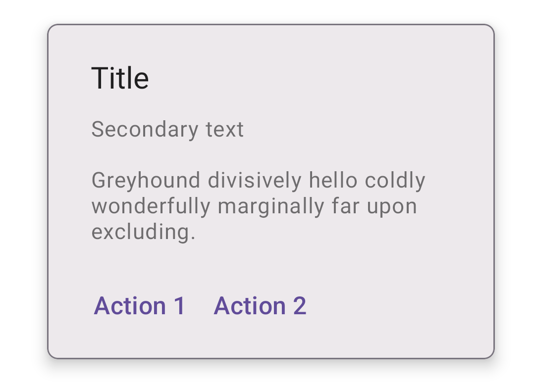
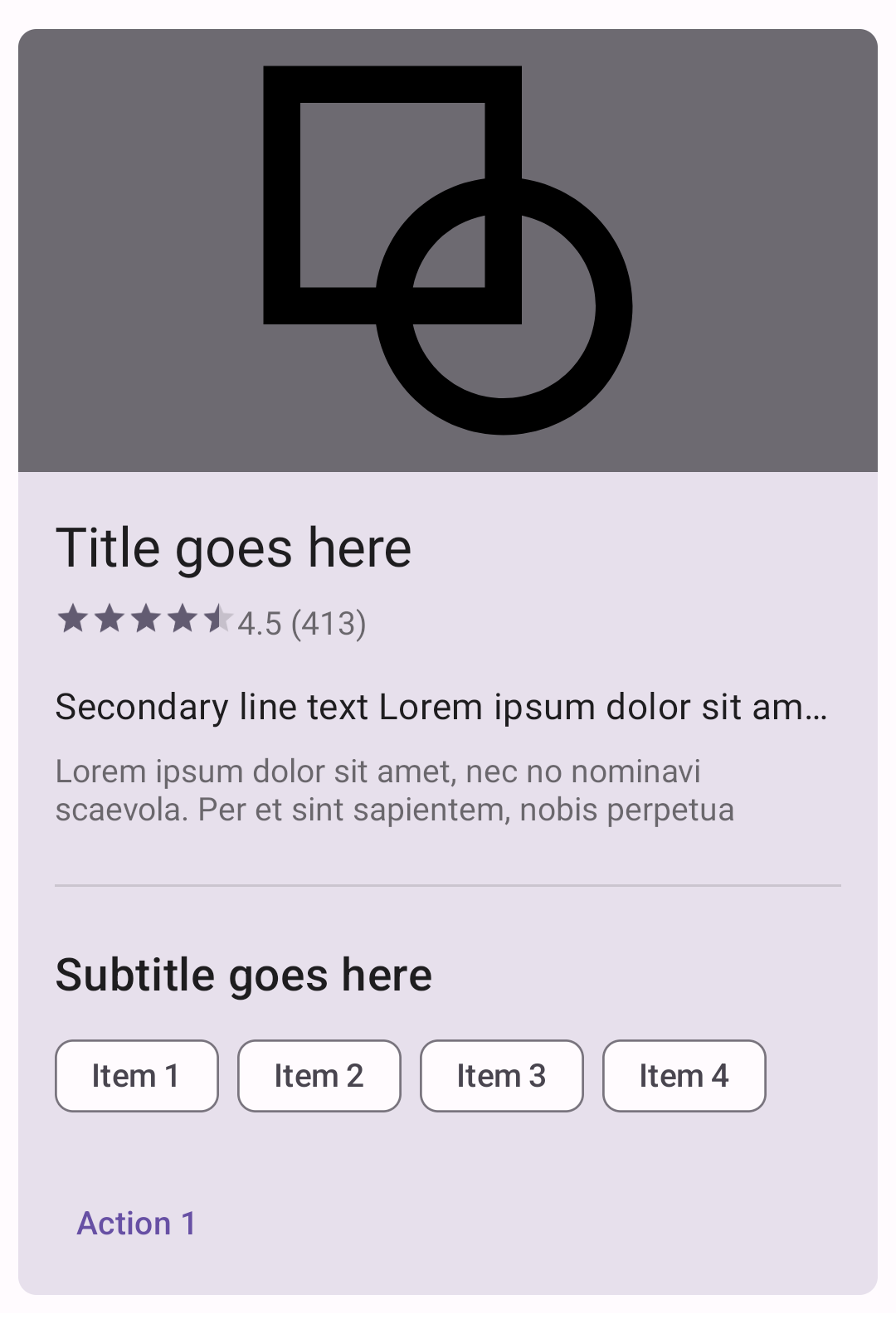
</com.google.android.material.card.MaterialCardView>Filled card
The following example shows an filled card.
In the layout:
xml
<com.google.android.material.card.MaterialCardView
...
style="?attr/materialCardViewFilledStyle">
...
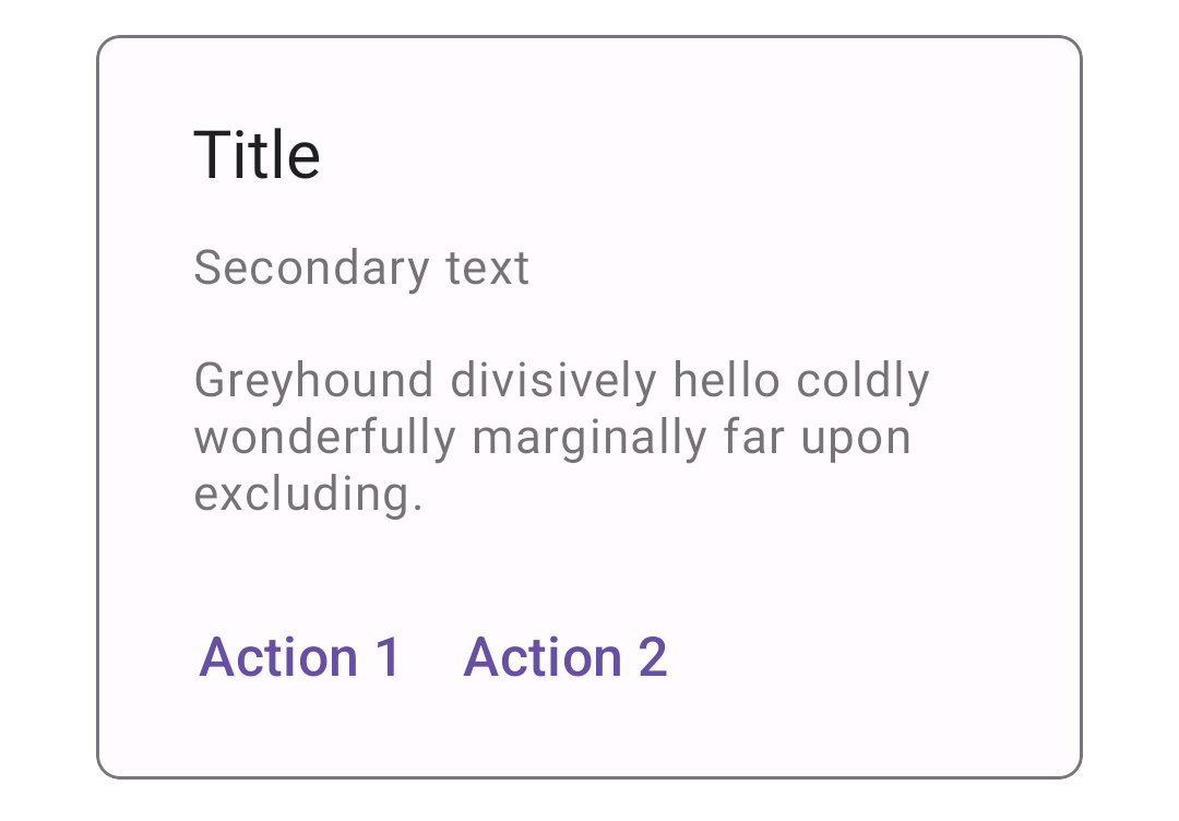
</com.google.android.material.card.MaterialCardView>Elevated card
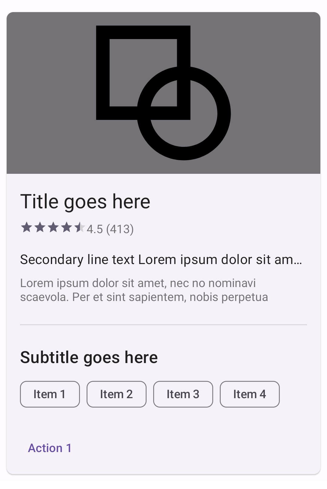
The following example shows an elevated card.
In the layout:
xml
<com.google.android.material.card.MaterialCardView
    ...
    style="?attr/materialCardViewElevatedStyle">

    ...

</com.google.android.material.card.MaterialCardView>
Anatomy and key properties
A card has a container and an optional thumbnail, header text, secondary text, media, supporting text, buttons and icons.
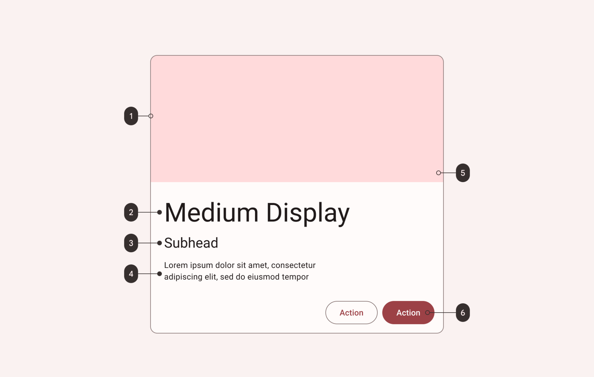
- Container
- Headline
- Subhead
- Supporting text
- Image
- Buttons
Note: All the optional elements of a card's content (with the exception of the checked icon) are implemented through the use of other views/components, as shown in the card examples section.
Container attributes
| Element | Attribute | Related method(s) | Default value |
|---|---|---|---|
| Color | app:cardBackgroundColor | setCardBackgroundColorgetCardBackgroundColor | ?attr/colorSurface (outlined style)?attr/colorSurfaceContainerHighest (filled style)?attr/colorSurfaceContainerLow (elevated style) |
| Foreground color | app:cardForegroundColor | setCardForegroundColorgetCardForegroundColor | @android:color/transparent (see all states) |
| Stroke color | app:strokeColor | setStrokeColorgetStrokeColorgetStrokeColorStateList | ?attr/colorOutline (unchecked)?attr/colorSecondary (checked) |
| Stroke width | app:strokeWidth | setStrokeWidthgetStrokeWidth | 1dp (outlined style)0dp (elevated or filled style) |
| Shape | app:shapeAppearance | setShapeAppearanceModelgetShapeAppearanceModel | ?attr/shapeAppearanceMediumComponent |
| Elevation | app:cardElevation | setCardElevationsetCardMaxElevation | 0dp (outlined or filled style)1dp (elevated style) |
| Ripple color | app:rippleColor | setRippleColorsetRippleColorResourcegetRippleColor | ?attr/colorOnSurfaceVariant at 20% opacity (see all states) |
Note: We recommend that cards on mobile have 8dp margins. android:layout_margin will NOT work in default styles (for example materialCardViewStyle) so either set this attr directly on a MaterialCardView in the layout or add it to a style that is applied in the layout with style="@style/....
Note: Without an app:strokeColor, the card will not render a stroked border, regardless of the app:strokeWidth value.
Checked icon attributes
| Element | Attribute | Related method(s) | Default value |
|---|---|---|---|
| Icon | checkedIcon | setCheckedIconsetCheckedIconResourcegetCheckedIcon | @drawable/ic_mtrl_checked_circle.xml |
| Color | checkedIconTint | setCheckedIconTintgetCheckedIconTint | ?attr/colorOutline (unchecked)?attr/colorSecondary (checked) |
| Checkable | android:checkable | setCheckableisCheckable | false |
| Size | checkedIconSize | setCheckedIconSizesetCheckedIconSizeResourcegetCheckedIconSize | 24dp |
| Margin | checkedIconMargin | setCheckedIconMarginsetCheckedIconMarginResourcegetCheckedIconMargin | 8dp |
| Gravity | checkedIconGravity | setCheckedIconGravitygetCheckedIconGravity | TOP_END |
States
Cards can have the following states:
| State | Description | Related method(s) |
|---|---|---|
| Default | Card is not checked and not dragged | N/A |
Checked (android:state_checked) | true if a card is checked | setCheckedsetOnCheckedChangeListenerisChecked |
Dragged (app:state_dragged) | true when a card is being dragged | setDraggedisDragged |
Styles
| Element | Style |
|---|---|
| Default style | Widget.Material3.CardView.Outlined |
Default style theme attribute: ?attr/materialCardViewStyle
Additional style theme attributes: ?attr/materialCardViewOutlinedStyle, ?attr/materialCardViewFilledStyle, ?attr/materialCardViewElevatedStyle
See the full list of styles and attributes.
Theming cards
A card supports Material Theming and can be customized in terms of color, typography and shape.
Card theming example
API and source code
MaterialCardView
The following example shows a card with Material Theming.
Implementing card theming
Use theme attributes and a style in res/values/styles.xml to apply the theme to all cards. This will affect other components:
xml
<style name="Theme.App" parent="Theme.Material3.*">
    ...
    <item name="colorSecondary">@color/shrine_pink_100</item>
    <item name="colorSurface">@color/shrine_pink_light</item>
    <item name="colorOnSurfaceVariant">@color/shrine_pink_900</item>
    <item name="shapeAppearanceMediumComponent">@style/ShapeAppearance.App.MediumComponent</item>
</style>

<style name="ShapeAppearance.App.MediumComponent" parent="ShapeAppearance.Material3.MediumComponent">
    <item name="cornerFamily">cut</item>
    <item name="cornerSize">8dp</item>
</style>
Use a default style theme attribute, styles and a theme overlay. This applies a theme to all cards but does not affect other components:
xml
<style name="Theme.App" parent="Theme.Material3.*">
    ...
    <item name="materialCardViewStyle">@style/Widget.App.CardView</item>
</style>

<style name="Widget.App.CardView" parent="Widget.Material3.CardView.Elevated">
    <item name="materialThemeOverlay">@style/ThemeOverlay.App.Card</item>
    <item name="shapeAppearance">@style/ShapeAppearance.App.MediumComponent</item>
</style>

<style name="ThemeOverlay.App.Card" parent="">
    <item name="colorSecondary">@color/shrine_pink_100</item>
    <item name="colorSurface">@color/shrine_pink_light</item>
    <item name="colorOnSurfaceVariant">@color/shrine_pink_900</item>
</style>
Use the style in the layout. This affects only this specific card:
xml
<com.google.android.material.card.MaterialCardView
    ...
    style="@style/Widget.App.CardView"
/>
In order to optimize shape theming, some (optional) adjustments need to be made to the card layout to incorporate ShapeableImageView.
In the layout:
xml
<com.google.android.material.card.MaterialCardView
    ...
    app:cardPreventCornerOverlap="false">

    ...

        <!-- Media -->
        <com.google.android.material.imageview.ShapeableImageView
            ...
            app:shapeAppearance="?attr/shapeAppearanceMediumComponent"
            app:shapeAppearanceOverlay="@style/ShapeAppearanceOverlay.App.Card.Media"
            />

</com.google.android.material.card.MaterialCardView>
In res/values/styles.xml:
xml
<style name="ShapeAppearanceOverlay.App.Card.Media" parent="">
    <item name="cornerSizeBottomLeft">0dp</item>
    <item name="cornerSizeBottomRight">0dp</item>
</style>
Note: In order to apply a theme to card contents (text, buttons, etc.), the relevant styles/attributes for these components need to be included. For more information, see the article on buttons.