Appearance
Select
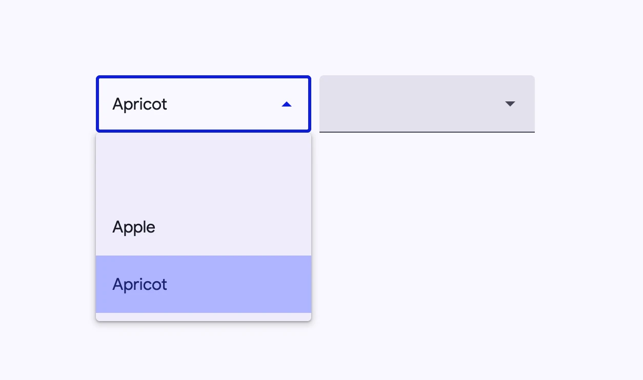
Select menus display a list of choices on temporary surfaces and display the currently selected menu item above the menu.
- Design article (coming soon)
- API Documentation
- Source code
Usage
Select (also referred to as a dropdown menu) allows choosing a value from a fixed list of available options. It is analogous to the native HTML <select> element.

html
<md-outlined-select>
  <md-select-option aria-label="blank"></md-select-option>
  <md-select-option selected value="apple">
    <div slot="headline">Apple</div>
  </md-select-option>
  <md-select-option value="apricot">
    <div slot="headline">Apricot</div>
  </md-select-option>
</md-outlined-select>

<md-filled-select>
  <md-select-option aria-label="blank"></md-select-option>
  <md-select-option value="apple">
    <div slot="headline">Apple</div>
  </md-select-option>
  <md-select-option value="apricot">
    <div slot="headline">Apricot</div>
  </md-select-option>
</md-filled-select>
Required select
Indicate that a selection is mandatory by adding the required attribute.
html
<md-filled-select required>
  <md-select-option value="one">
    <div slot="headline">One</div>
  </md-select-option>
  <md-select-option value="two">
    <div slot="headline">Two</div>
  </md-select-option>
</md-filled-select>
Theming
Select supports Material theming and can be customized in terms of color, typography, and shape.
Filled Select tokens
| Token | Default value |
|---|---|
--md-filled-select-text-field-container-color | --md-sys-color-surface-container-highest |
--md-filled-select-text-field-container-shape | --md-sys-shape-corner-extra-small |
--md-filled-select-text-field-input-text-color | --md-sys-color-on-surface |
--md-filled-select-text-field-input-text-font | --md-sys-typescale-body-large-font |
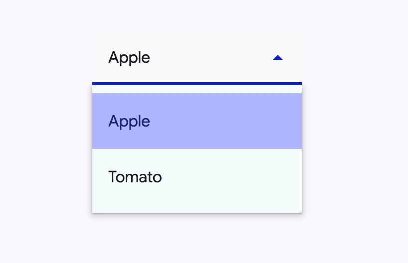
To theme the select's dropdown menu, use the md-menu component tokens on the ::part(menu) selector.
Filled Select example

html
<style>
:root {
  --md-filled-select-text-field-container-shape: 0px;
  --md-filled-select-text-field-container-color: #f7faf9;
  --md-filled-select-text-field-input-text-color: #005353;
  --md-filled-select-text-field-input-text-font: system-ui;
}

md-filled-select::part(menu) {
  --md-menu-container-color: #f4fbfa;
  --md-menu-container-shape: 0px;
}
</style>

<md-filled-select>
  <md-select-option selected value="apple">
    <div slot="headline">Apple</div>
  </md-select-option>
  <md-select-option value="tomato">
    <div slot="headline">Tomato</div>
  </md-select-option>
</md-filled-select>
Outlined Select tokens
| Token | Default value |
|---|---|
--md-outlined-select-text-field-outline-color | --md-sys-color-outline |
--md-outlined-select-text-field-container-shape | --md-sys-shape-corner-extra-small |
--md-outlined-select-text-field-input-text-color | --md-sys-color-on-surface |
--md-outlined-select-text-field-input-text-font | --md-sys-typescale-body-large-font |
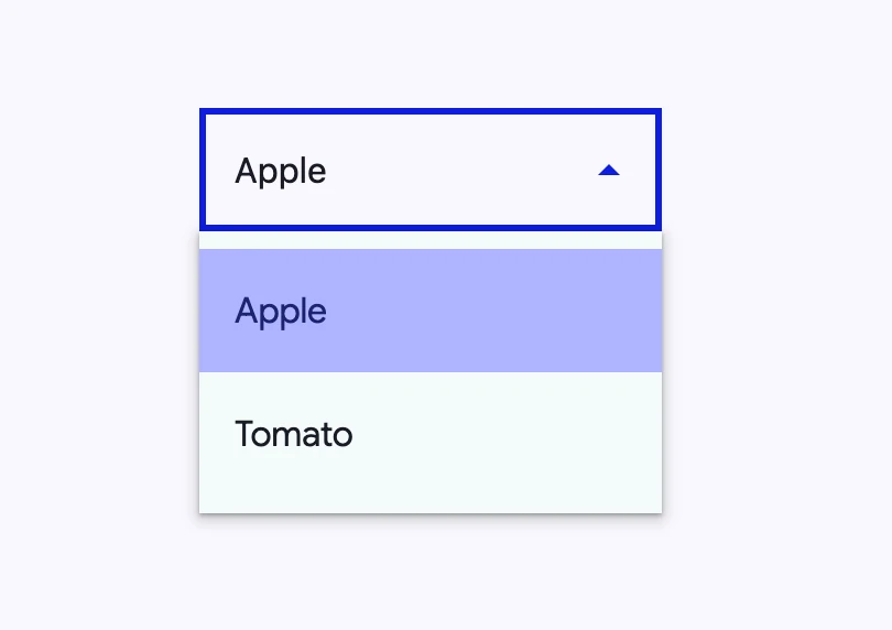
Outlined Select example

html
<style>
:root {
  --md-outlined-select-text-field-outline-color: #6e7979;
  --md-outlined-select-text-field-container-shape: 0px;
  --md-outlined-select-text-field-input-text-color: #005353;
  --md-outlined-select-text-field-input-text-font: system-ui;
}

md-outlined-select::part(menu) {
  --md-menu-container-color: #f4fbfa;
  --md-menu-container-shape: 0px;
}
</style>

<md-outlined-select>
  <md-select-option selected value="apple">
    <div slot="headline">Apple</div>
  </md-select-option>
  <md-select-option value="tomato">
    <div slot="headline">Tomato</div>
  </md-select-option>
</md-outlined-select>
API
MdFilledSelect <md-filled-select>
Properties
| Property | Attribute | Type | Default | Description |
|---|---|---|---|---|
quick | quick | boolean | false | Opens the menu synchronously with no animation. |
required | required | boolean | false | Whether or not the select is required. |
errorText | error-text | string | '' | The error message that replaces supporting text when error is true. If errorText is an empty string, then the supporting text will continue to show.This error message overrides the error message displayed by reportValidity(). |
label | label | string | '' | The floating label for the field. |
noAsterisk | no-asterisk | boolean | false | Disables the asterisk on the floating label, when the select is required. |
supportingText | supporting-text | string | '' | Conveys additional information below the select, such as how it should be used. |
error | error | boolean | false | Gets or sets whether or not the select is in a visually invalid state. This error state overrides the error state controlled by reportValidity(). |
menuPositioning | menu-positioning | string | 'popover' | Whether or not the underlying md-menu should be position: fixed to display in a top-level manner, or position: absolute. position:fixed is useful for cases where select is inside of another element with stacking context and hidden overflows such as md-dialog. |
clampMenuWidth | clamp-menu-width | boolean | false | Clamps the menu-width to the width of the select. |
typeaheadDelay | typeahead-delay | number | DEFAULT_TYPEAHEAD_BUFFER_TIME | The max time between the keystrokes of the typeahead select / menu behavior before it clears the typeahead buffer. |
hasLeadingIcon | has-leading-icon | boolean | false | Whether or not the text field has a leading icon. Used for SSR. |
displayText | display-text | string | '' | Text to display in the field. Only set for SSR. |
menuAlign | menu-align | string | 'start' | Whether the menu should be aligned to the start or the end of the select's textbox. |
value | value | string | undefined | |
selectedIndex | selected-index | number | undefined | |
disabled | boolean | undefined | ||
name | string | undefined | ||
options | SelectOption[] | undefined | ||
selectedOptions | SelectOption[] | undefined |
Methods
| Method | Parameters | Returns | Description |
|---|---|---|---|
select | value | void | Selects an option given the value of the option, and updates MdSelect's value. |
selectIndex | index | void | Selects an option given the index of the option, and updates MdSelect's value. |
reset | None | void | Reset the select to its default value. |
getUpdateComplete | None | Promise<boolean> | |
formResetCallback | None | void | |
formStateRestoreCallback | state | void | |
click | None | void |
Events
| Event | Type | Bubbles | Composed | Description |
|---|---|---|---|---|
change | Event | Yes | No | The native change event on <input> |
input | InputEvent | Yes | Yes | The native input event on <input> |
opening | Event | No | No | Fired when the select's menu is about to open. |
opened | Event | No | No | Fired when the select's menu has finished animations and opened. |
closing | Event | No | No | Fired when the select's menu is about to close. |
closed | Event | No | No | Fired when the select's menu has finished animations and closed. |
MdOutlinedSelect <md-outlined-select>
Properties
| Property | Attribute | Type | Default | Description |
|---|---|---|---|---|
quick | quick | boolean | false | Opens the menu synchronously with no animation. |
required | required | boolean | false | Whether or not the select is required. |
errorText | error-text | string | '' | The error message that replaces supporting text when error is true. If errorText is an empty string, then the supporting text will continue to show.This error message overrides the error message displayed by reportValidity(). |
label | label | string | '' | The floating label for the field. |
noAsterisk | no-asterisk | boolean | false | Disables the asterisk on the floating label, when the select is required. |
supportingText | supporting-text | string | '' | Conveys additional information below the select, such as how it should be used. |
error | error | boolean | false | Gets or sets whether or not the select is in a visually invalid state. This error state overrides the error state controlled by reportValidity(). |
menuPositioning | menu-positioning | string | 'popover' | Whether or not the underlying md-menu should be position: fixed to display in a top-level manner, or position: absolute. position:fixed is useful for cases where select is inside of another element with stacking context and hidden overflows such as md-dialog. |
clampMenuWidth | clamp-menu-width | boolean | false | Clamps the menu-width to the width of the select. |
typeaheadDelay | typeahead-delay | number | DEFAULT_TYPEAHEAD_BUFFER_TIME | The max time between the keystrokes of the typeahead select / menu behavior before it clears the typeahead buffer. |
hasLeadingIcon | has-leading-icon | boolean | false | Whether or not the text field has a leading icon. Used for SSR. |
displayText | display-text | string | '' | Text to display in the field. Only set for SSR. |
menuAlign | menu-align | string | 'start' | Whether the menu should be aligned to the start or the end of the select's textbox. |
value | value | string | undefined | |
selectedIndex | selected-index | number | undefined | |
disabled | boolean | undefined | ||
name | string | undefined | ||
options | SelectOption[] | undefined | ||
selectedOptions | SelectOption[] | undefined |
Methods
| Method | Parameters | Returns | Description |
|---|---|---|---|
select | value | void | Selects an option given the value of the option, and updates MdSelect's value. |
selectIndex | index | void | Selects an option given the index of the option, and updates MdSelect's value. |
reset | None | void | Reset the select to its default value. |
getUpdateComplete | None | Promise<boolean> | |
formResetCallback | None | void | |
formStateRestoreCallback | state | void | |
click | None | void |
Events
| Event | Type | Bubbles | Composed | Description |
|---|---|---|---|---|
change | Event | Yes | No | The native change event on <input> |
input | InputEvent | Yes | Yes | The native input event on <input> |
opening | Event | No | No | Fired when the select's menu is about to open. |
opened | Event | No | No | Fired when the select's menu has finished animations and opened. |
closing | Event | No | No | Fired when the select's menu is about to close. |
closed | Event | No | No | Fired when the select's menu has finished animations and closed. |
MdSelectOption <md-select-option>
Properties
| Property | Attribute | Type | Default | Description |
|---|---|---|---|---|
disabled | disabled | boolean | false | Disables the item and makes it non-selectable and non-interactive. |
selected | selected | boolean | false | Sets the item in the selected visual state when a submenu is opened. |
value | value | string | '' | Form value of the option. |
type | string | 'option' as const | ||
typeaheadText | string | undefined | ||
displayText | string | undefined |
Events
| Event | Type | Bubbles | Composed | Description |
|---|---|---|---|---|
close-menu | CustomEvent<{initiator: SelectOption, reason: Reason, itemPath: SelectOption[]}> | Yes | Yes | Closes the encapsulating menu on closable interaction. |
request-selection | Event | Yes | Yes | Requests the parent md-select to select this element (and deselect others if single-selection) when selected changed to true. |
request-deselection | Event | Yes | Yes | Requests the parent md-select to deselect this element when selected changed to false. |