Appearance
Elevation
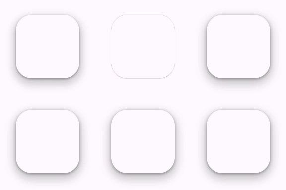
Elevation is the relative distance between two surfaces along the z-axis.
Material's elevation system is deliberately limited to just a handful of levels. This creative constraint means you need to make thoughtful decisions about your UI’s elevation story.
Usage
Elevation can be set from 0 to 5 using the --md-elevation-level CSS custom property. The elevation will automatically fill the nearest position: relative element's size and shape.
html
<style>
  .surface {
    position: relative;
    border-radius: 16px;
    height: 64px;
    width: 64px;

    --md-elevation-level: 3;
  }
</style>
<div class="surface">
  <md-elevation></md-elevation>
  <!-- Content -->
</div>
Animation
Shadows may be animated between levels by adding transition-duration and transition-easing-function CSS properties.

html
<style>
  .surface {
    /* ... */
    transition-duration: 250ms;
    transition-timing-function: ease-in-out;

    --md-elevation-level: 3;
  }

  .surface:active {
    --md-elevation-level: 0;
  }
</style>
<div class="surface">
  <md-elevation></md-elevation>
  <!-- Content -->
</div>
Accessibility
Elevation is a visual component and does not have accessibility concerns.
Theming
Elevation supports Material theming and can be customized in terms of color.
Tokens
| Token | Default value |
|---|---|
--md-elevation-level | 0 |
--md-elevation-shadow-color | --md-sys-color-shadow |
Example
html
<style>
  .surface {
    position: relative;
    border-radius: 16px;
    height: 64px;
    width: 64px;
  }

  :root {
    --md-elevation-level: 5;
    --md-sys-color-shadow: #006A6A;
  }
</style>
<div class="surface">
  <md-elevation></md-elevation>
  <!-- Content -->
</div>